Choosing a logo color palette can feel surprisingly high stakes. One combination looks polished and professional, while another feels outdated before you even finish the design. With countless colors to choose from, narrowing down the right palette for your brand can quickly turn into hours of second-guessing.
The good news is that you don’t need to start from a blank canvas. Looking at successful logo color combinations is one of the fastest ways to identify what fits your brand’s personality, industry, and audience.
This collection of 50 logo color combinations is packed with ideas for businesses at every stage, from brand-new startups to established companies ready for a refresh. Use these examples as inspiration when designing your logo with GoDaddy’s free logo maker or building your website with Airo AI Builder.
The best color combinations for logos
No matter your industry, the right logo color combination can help your brand look polished and professional. A well-chosen palette creates visual balance while making it easier for customers to recognize your business across your website, social media, and marketing materials.
Colors also help shape first impressions. The shades you choose can communicate your brand’s personality and build familiarity with your audience over time.
If you’re looking for inspiration, these logo color combinations can help you find a palette that fits your brand and stands out for the right reasons. If you’re new to all this, start with our guide on how to make a logo. Or, if you’re redesigning a logo you already have, check out our guide on effective logo redesign strategies.
Here are the three main color combinations for logos that drive business success for your information (a quick FYI).
Analogous color combinations
Analogous color combinations usually consist of two to five different tones on the color wheel. Typically, each color blends seamlessly, creating a sense of visual harmony. You’ll usually see this mixture of complementary tones in the natural world (think leaves, bark, and foliage).
Complementary color combinations
Despite the name, complementary color combinations usually consist of two or more tones that sit on the opposite side of the color wheel. While these combos are contrasting in tone, they work together to create a striking visual presence that is crisp and turns heads.
Triadic color combinations
These deep, vibrant three-color patterns consist of tones from different sections of the color wheel. You can choose a triadic color combo by taking the color wheel, putting your cursor or pencil on your preferred main tone, and drawing an even triangle. The colors that form the three points of your triangle will become your triadic logo combination.
How many colors should I use in a logo?
As a general rule of thumb, any type of logo should have two to three colors. Too many tones will cause visual confusion, making your logo busy and unappealing.
To turn heads and create a logo that wins on the commercial battlefield, you should choose one dominant color that you feel represents your brand personality and one or two supporting tones to create extra depth. The main goal here is to pick a business color palette that’s easy on the eye, clean-cut, and will make people remember you.
50 examples of good color combinations for logos
Now that you know all about the power of logo colors, let’s look at 50 examples of business color schemes you can put to work.
Two-color combinations
1. Jungle green and linen white
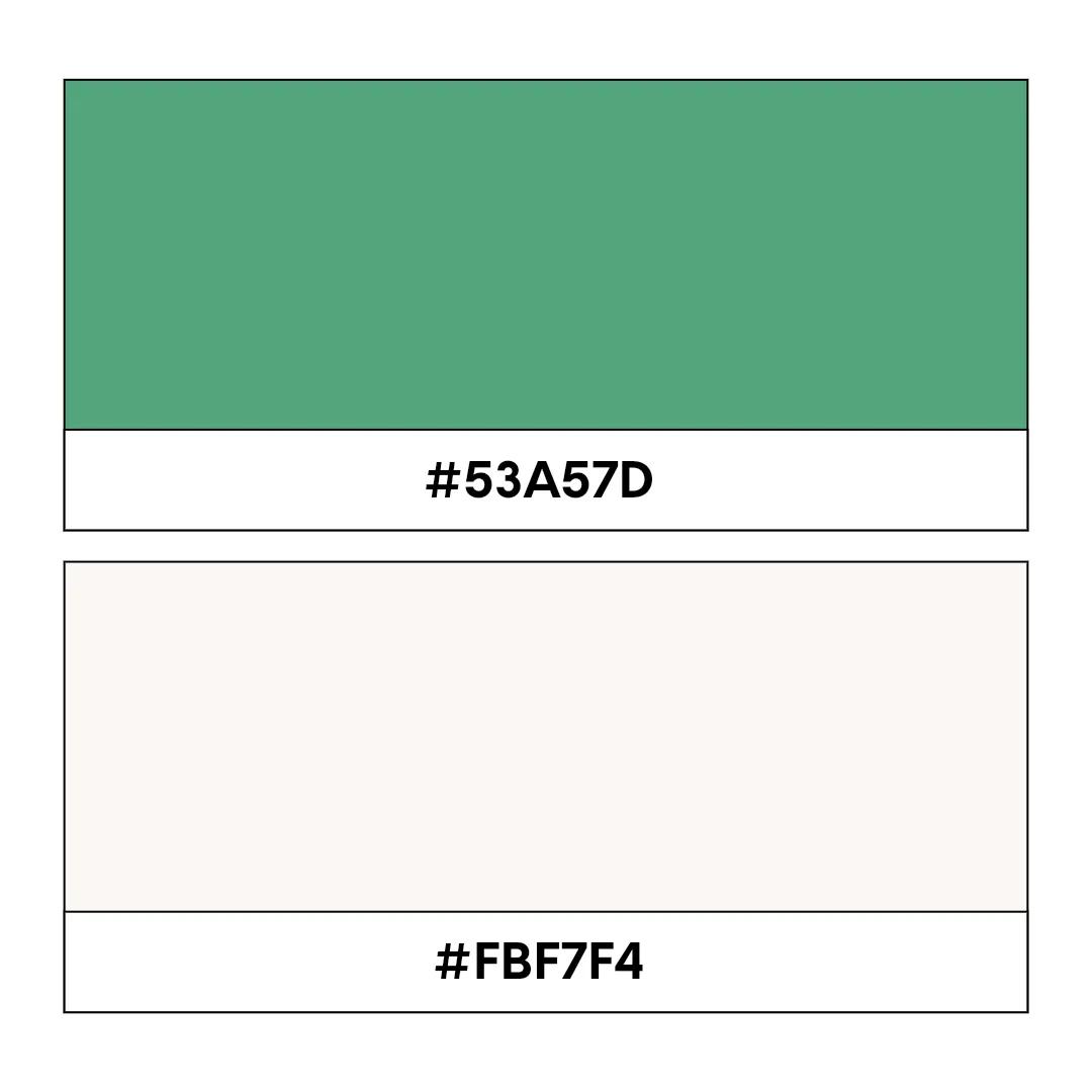
Jungle green code: #53A57D, Linen white code: #FBF7F4
Exotic without being too bold or overbearing, this harmonious two-color logo scheme is crisp, clean, and evokes feelings of warmth and relaxation. This is an ideal combo for brands in the healthcare, environmental awareness, and nature sectors.
2. Yellow and eggplant
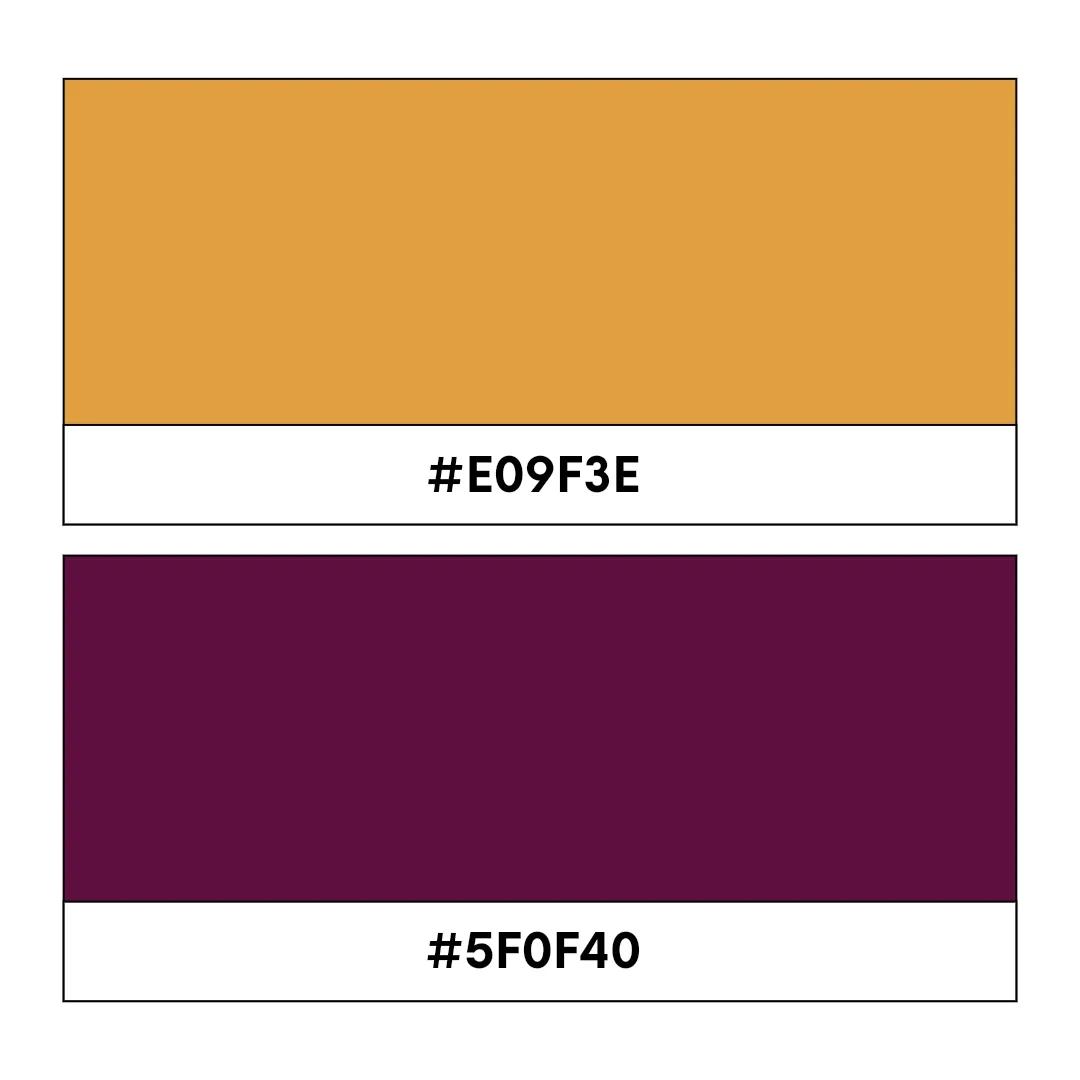
Yellow code: #E09F3E, Eggplant code: #5F0F40
This is a twist on the classic purple and yellow color combination. These hues create an almost regal color scheme that’s as tasteful as it is vibrant. The shaded yellow gradient adds a real visual depth, while the purple is warm, inviting, and creates a sense of calm. This is perfect for businesses in the wellness or hospitality sector.
3. Peach and burnt orange
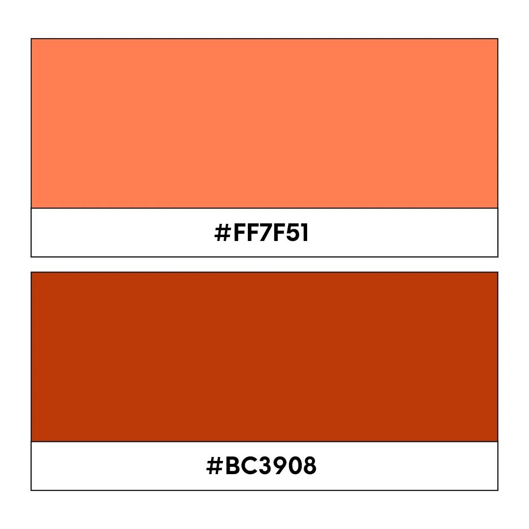
Peach code: #FF7F51, Burnt orange code: #BC3908
An analogous two-color scheme that boasts superior visual harmony, this irresistible combination is perfectly balanced. Both colors are contrasting but evenly matched, making for striking yet subtle branding with hues that businesses from a broad range of sectors can use to their advantage.
4. Tea green and moss

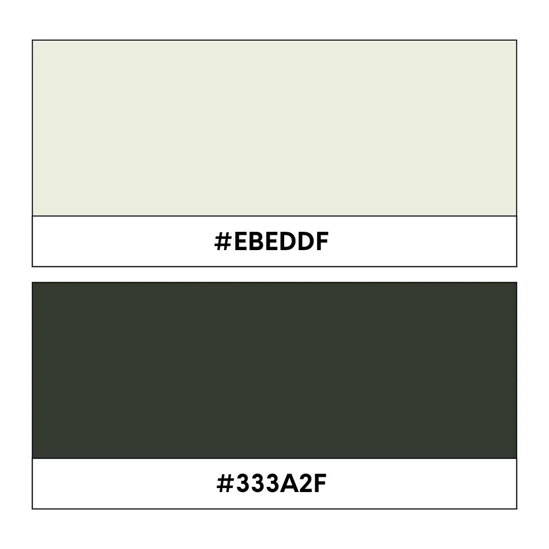
Tea green code: #EBEDDF, Moss code: #333A2F
Another two-color logo combo steeped in natural, earthy tones, this relaxing monochromatic blend is incredibly inviting and easy on the eye. Ideal for any brand with an eco-friendly mission or with services and products linked to the natural world, this business color scheme is understatedly dreamy.
5. Purple and pink
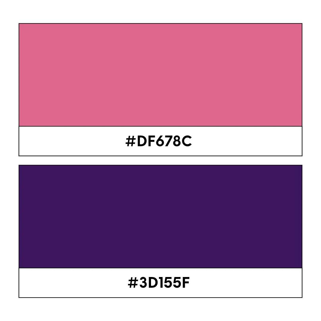
Pink code: #DF678C, Purple code: #3D155F
This playful two-tone classic will bounce off any flier, banner, or web page. There’s something super alluring about the contrasting blend of pink and purple. It’s a fitting mix for brands in the wellness and beauty blogging sector. Pink is the party, and purple is the business!
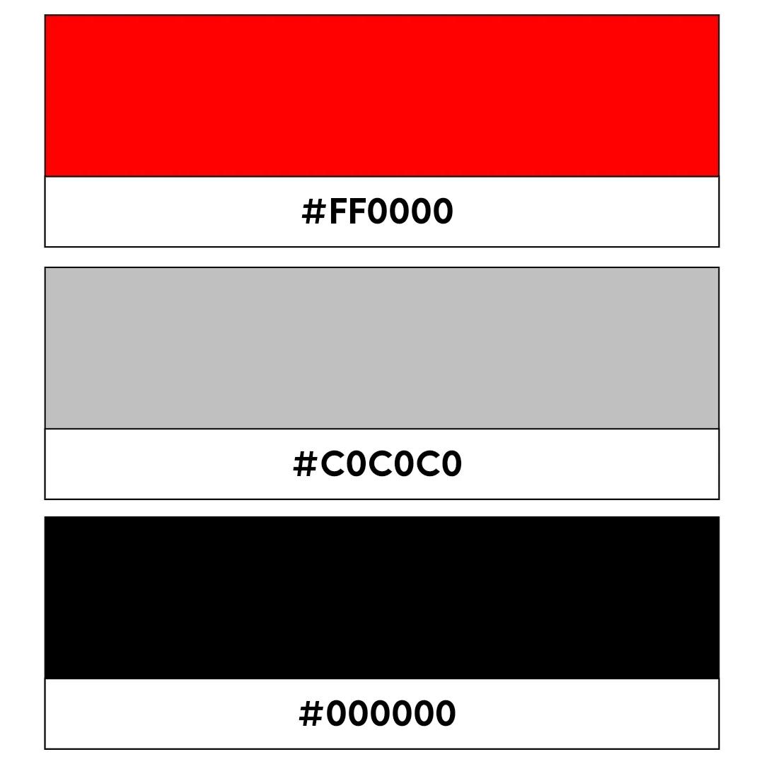
6. Black and red
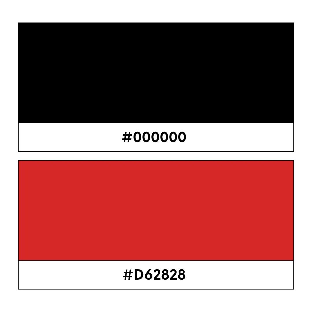
Black code: #000000, Red code: #D62828
This epic two-color combo conjures up feelings of power, dominance, and untapped energy. Red exudes feelings of excitement and danger while deep black hues punctuate the combination with an irresistibly cool. A perfect scheme for businesses offering services or products with decidedly edgy overtones.
7. Orange and blue

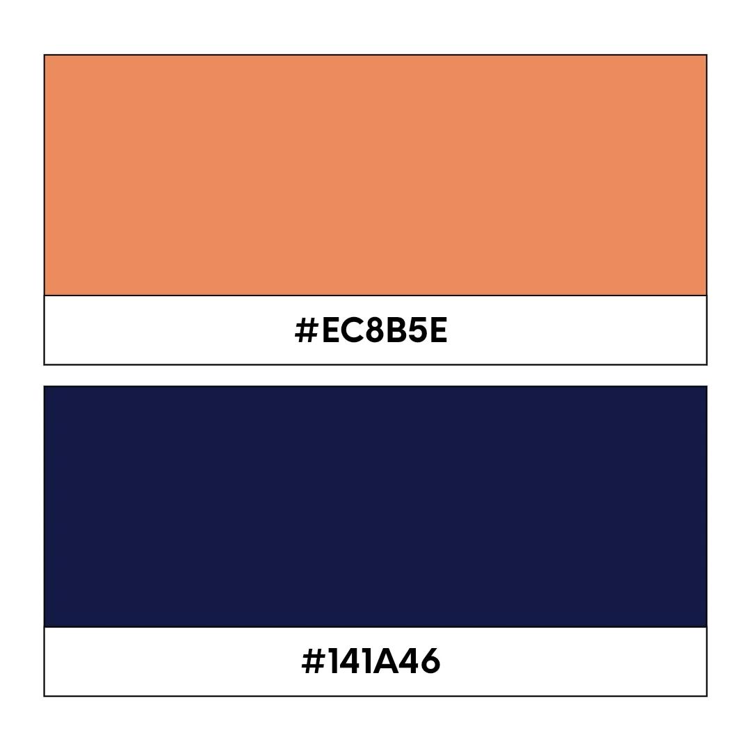
Orange code: #EC8B5E, Blue code: #141A46
This dynamic duo is punchy, powerful, and instantly draws visual attention. It’s unique without being too “out there,” making them perfectly suited to business in the tech or software-as-a-service (SaaS) niches.
8. Brown and mustard yellow
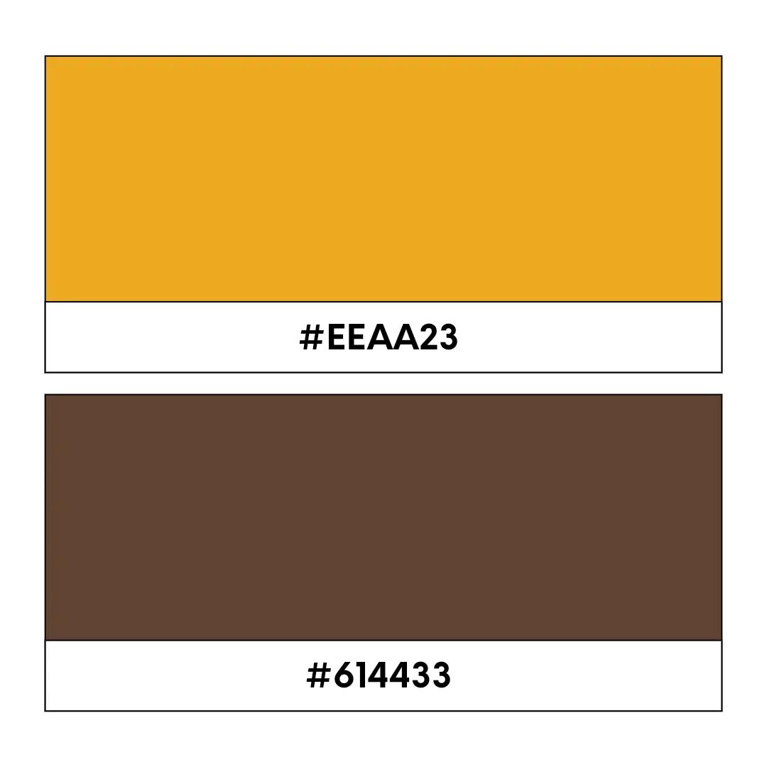
Mustard yellow code: #EEAA23, Brown code: #614433
This effortlessly laid-back vintage color scheme is perfect for any brand or business looking to give off a professional vibe, rounded off with a traditional sense of sophistication. A brilliant color scheme for boutiques, bars, restaurants, cafes, or anyone selling quality artisanal goods.
9. Teal and coral
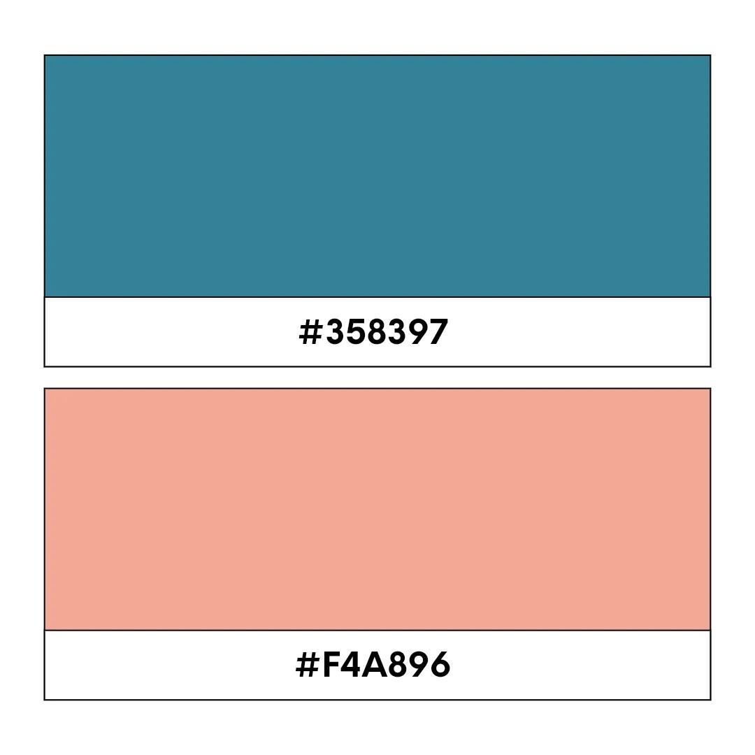
Teal code: #358397, Coral code: #F4A896
Joyous, fun, and totally vibrant, this zany two-tone combo will ooze playful energy. While you might think these colors would clash, they merge together in contrasting harmony to grab the eyes, hold attention, and bring a wry smile to the face. Perfect for brands looking to shake things up in their industry or creative freelancers looking to stand out from the competition.
10. Royal blue and pale yellow

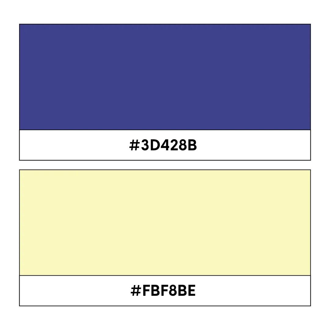
Royal blue code: #3D428B, Pale yellow code: #FBF8BE
This classic, highly trusted color combination is easy to digest. Its complementary nature evokes feelings of professionalism and stability, making it an excellent choice for businesses in the legal, finance, or emerging technologies sectors.
11. Charcoal black and gold
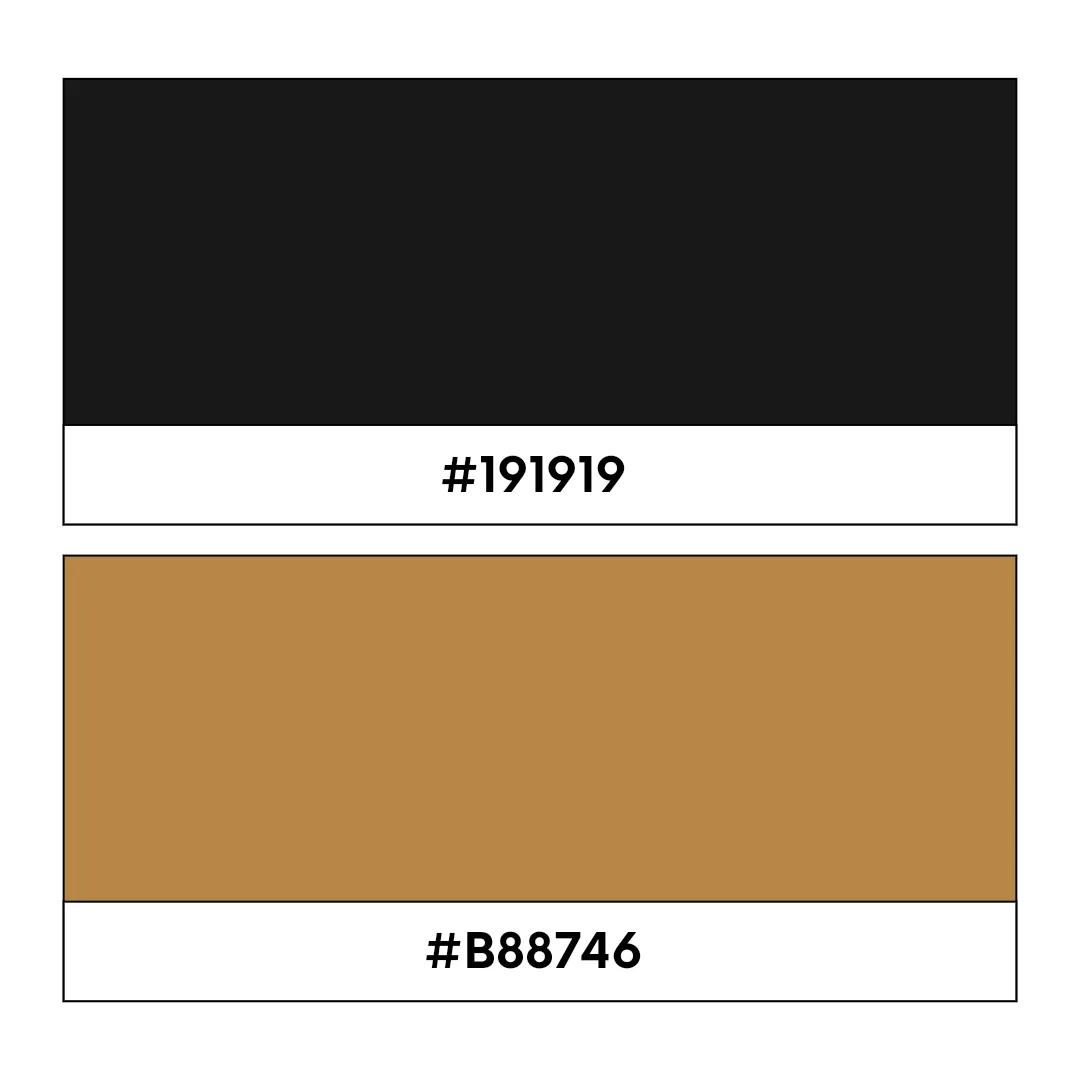
Charcoal black code: #191919, Gold code: #B88746
Gold paired with charcoal delivers a balance of confidence and sophistication. The contrast helps logos stand out, while the warm metallic tones keep the design approachable rather than overly formal. This color combination works well for brands that want to project authority, ambition, and a strong sense of identity.
12. Red and pink
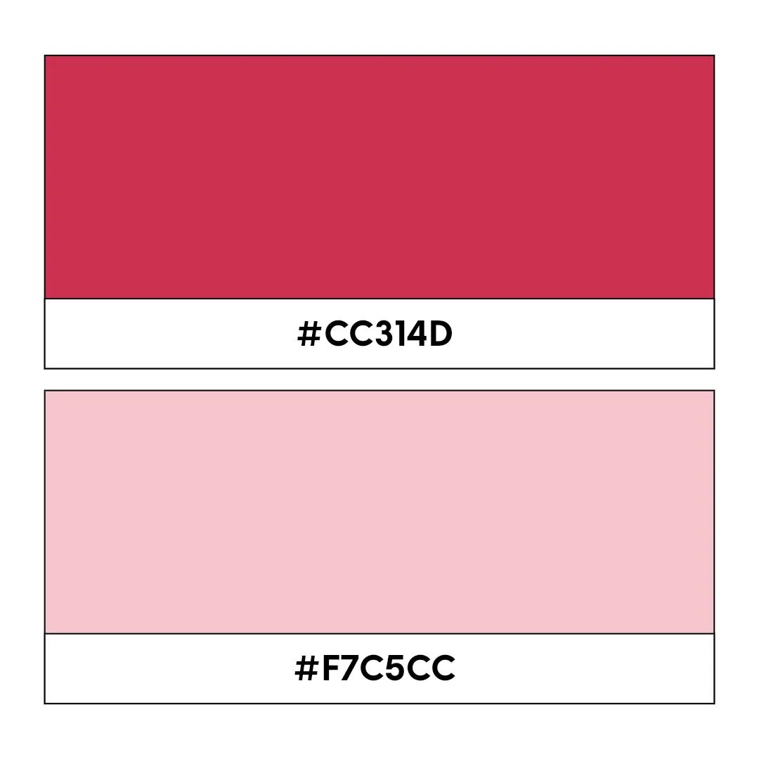
Red code: #CC314D, Pink code: #F7C5CC
Soft and bubbly yet strikingly contemporary, this analogous color scheme is inviting to the eyes and will make your logo fonts bounce off the page. The well-paired contrast of these two tones is a visual match made in heaven, and this color choice is the perfect way to showcase your playful brand personality.
13. Navy blue and copper
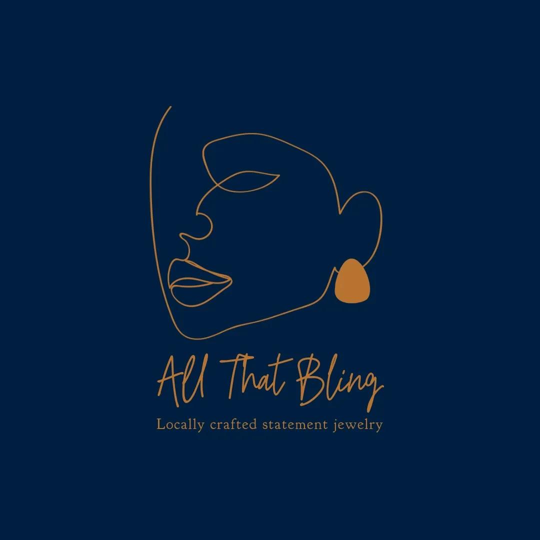
Navy blue code: #00203F, Copper code: #B87333
This stunning two-color combination evokes a sophisticated and modern feel. The deep navy blue provides a strong base while the copper adds real warmth and depth. It’s a versatile choice for businesses in the luxury or premium goods sector.
14. Emerald green and rose gold
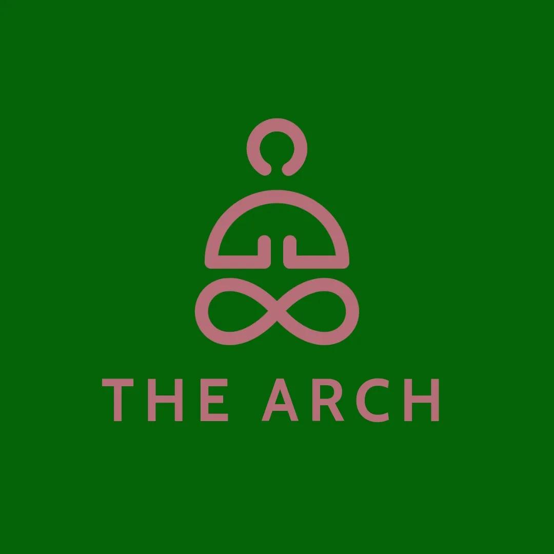
Emerald green code: #046307, Rose gold code: #B76E79
Emerald green and rose gold create an unlikely, harmonious color palette that will make your potential customers do a double-take. The deep, rich emerald green creates a sense of tranquility, while the soft, shimmering rose gold adds a splash of femininity. This lavish combo is perfect for brands in beauty, fashion, or wellness.
15. Fuchsia and neon green
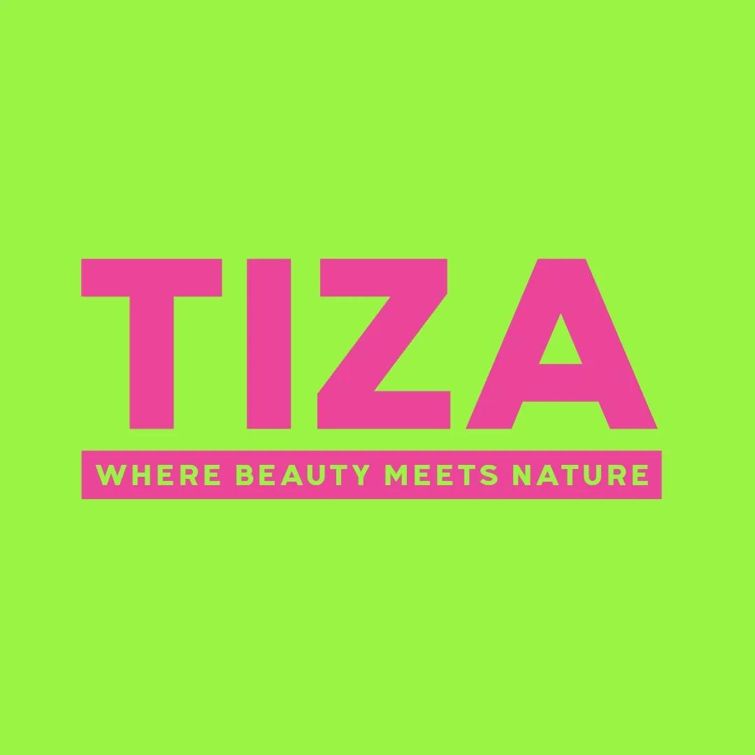
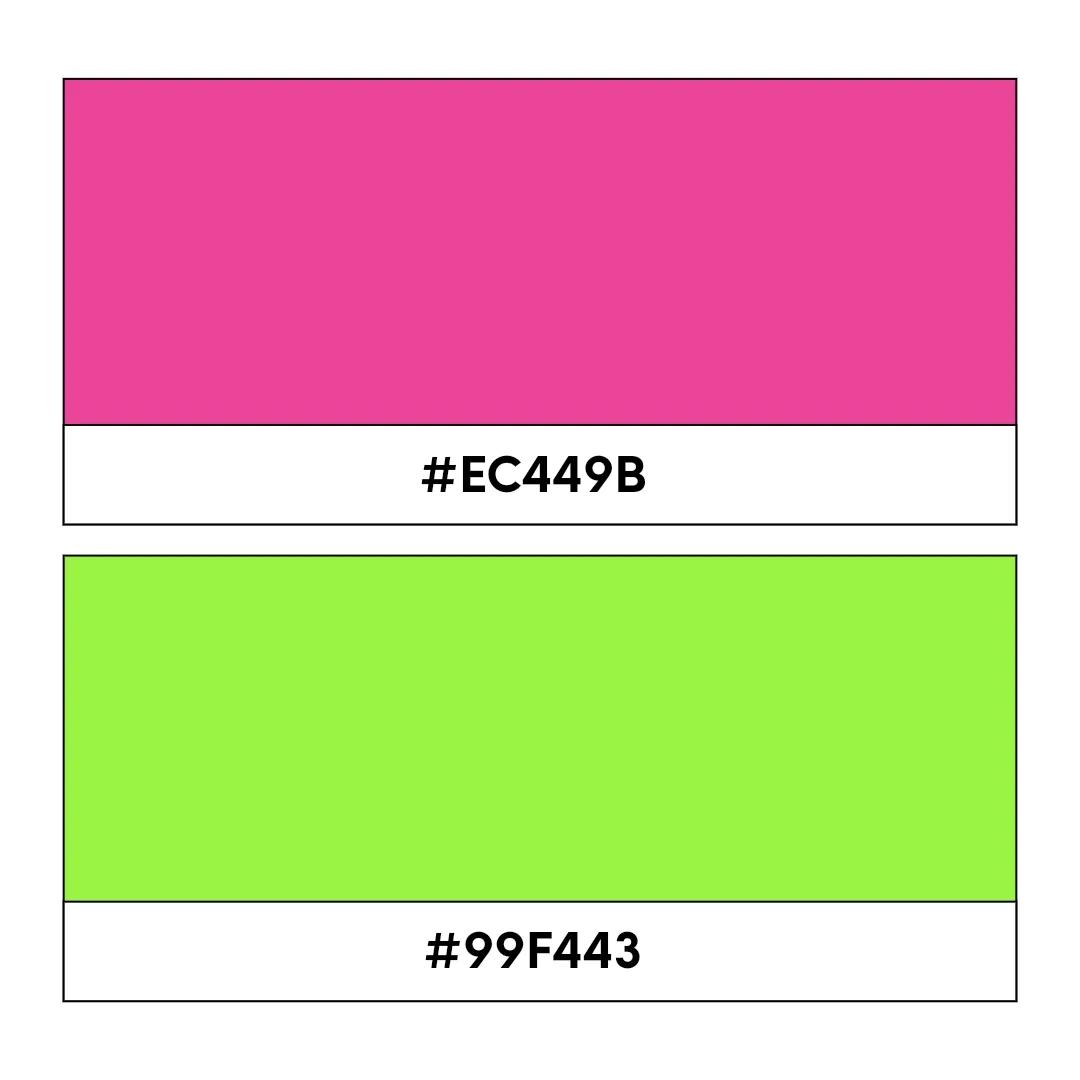
Fuschia code: #EC449B, Neon green code: #99F443
Fuchsia and neon green bring plenty of personality to a logo. The vibrant contrast creates a bold, eye-catching look that feels modern and confident. This color combination is a strong fit for brands that want to stand out in a crowded market, especially those in creative, fashion, entertainment, or lifestyle spaces.
16. Terracotta and sage green
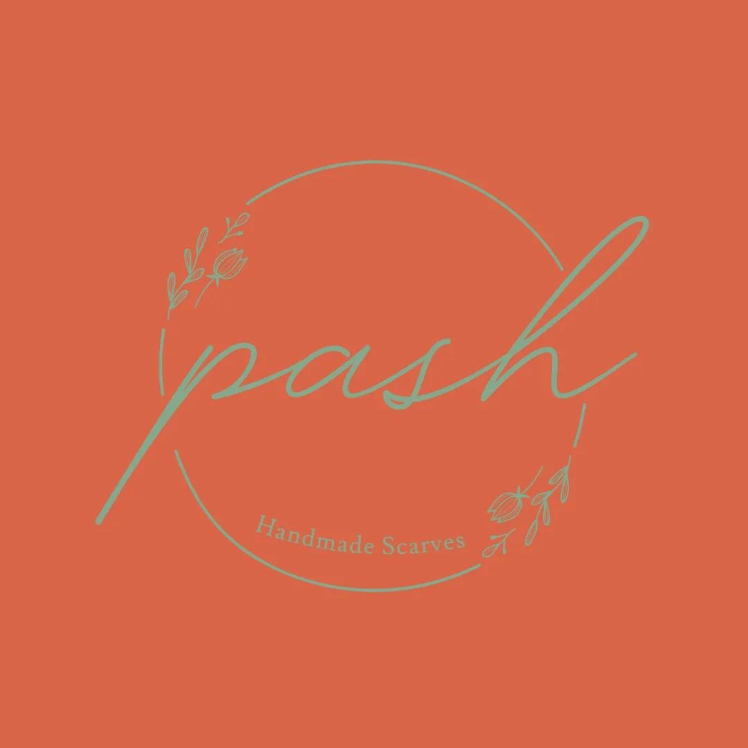
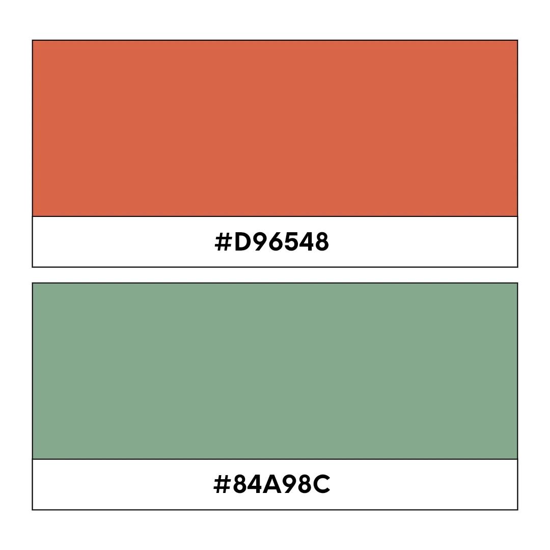
Terracotta code: #D96548, Sage green code: #84A98C
Terracotta and sage green weave together to offer a synergetic color palette that exudes feelings of warmth. The inviting terracotta evokes a sense of earthiness and optimism, while the soothing sage green brings a feeling of tranquility and funky freshness. This rich combo is ideal for brands associated with wellness, sustainability, or charity.
17. Silver and black

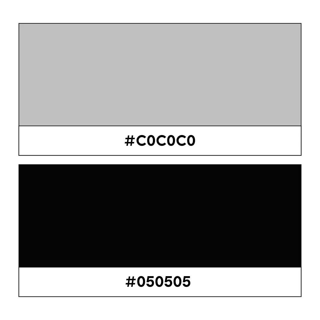
Silver code: #C0C0C0, Black code: #050505
Slick, striking, and futuristic, this sharp-as-nails two-color logo combination screams sophistication. Black throws out a sense of mystery, while the silver foil provides an accentuation that can make your fonts or your graphics pop. This is edgy yet professional and perfect for the likes of forward-thinking creative agencies, property developers, and sports brands.
18. Beige and rust

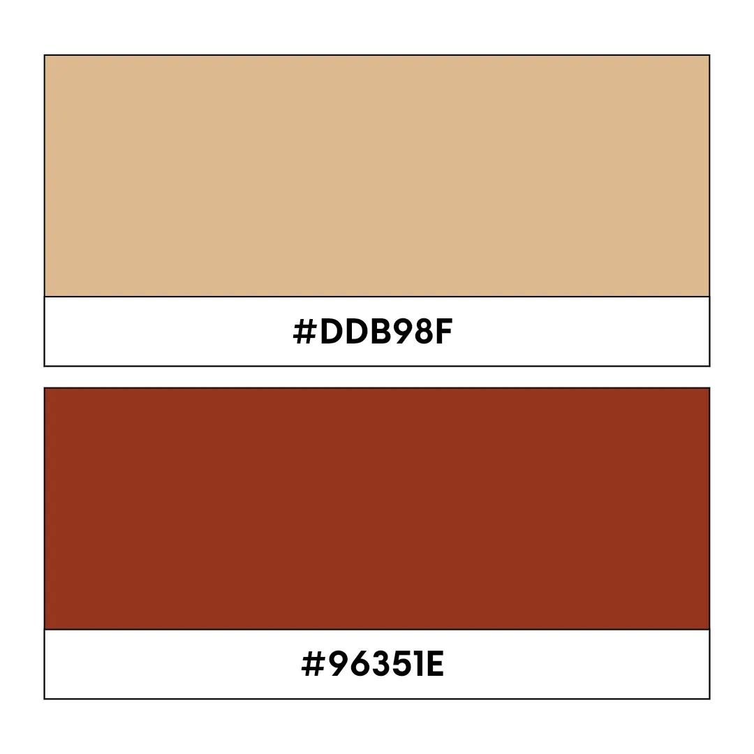
Beige code: #DDB98F, Rust code: #96351E
While gentle and understated, these two dreamy hues create a visual synergy that gives off a sense of warmth and maturity. The sandy tones provide a solid foundation, and the rust cuts through to provide the color scheme with a certain kind of subtle professionalism. This combo is ideal for businesses in the travel, lifestyle, or real estate sectors due to its inviting sense of sophistication.
19. Lavender and gold
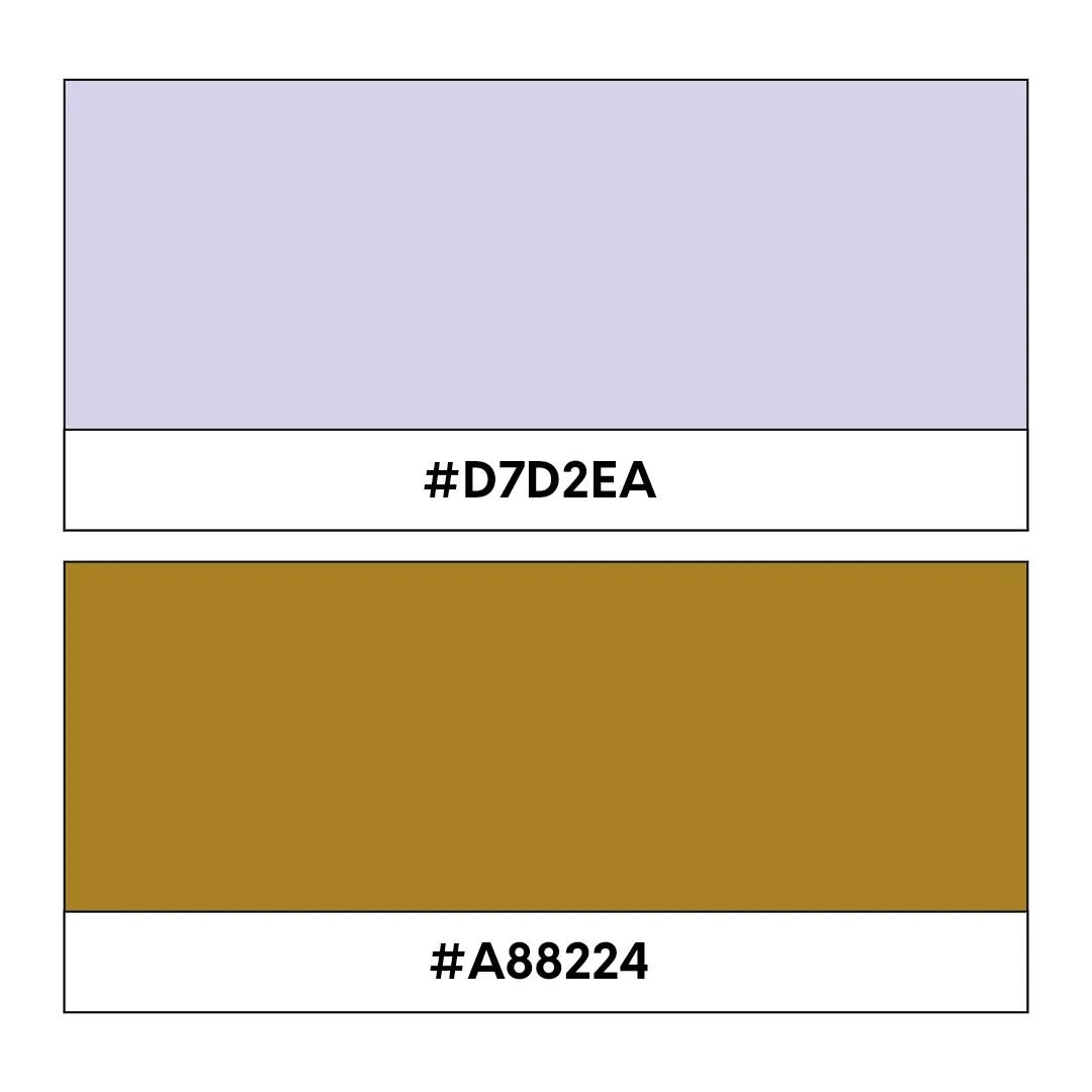
Lavender code: #D7D2EA, Gold code: #A88224
Lavender and gold create a worldly, eye-grabbing color palette. The softness of the lavender evokes feelings of tranquility and luxury, while the rich gold hues add a touch of elegance to the mix. This two-color combination is perfect for businesses targeting a high-end clientele in industries like fashion, beauty, or jewelry.
20. Coral and navy
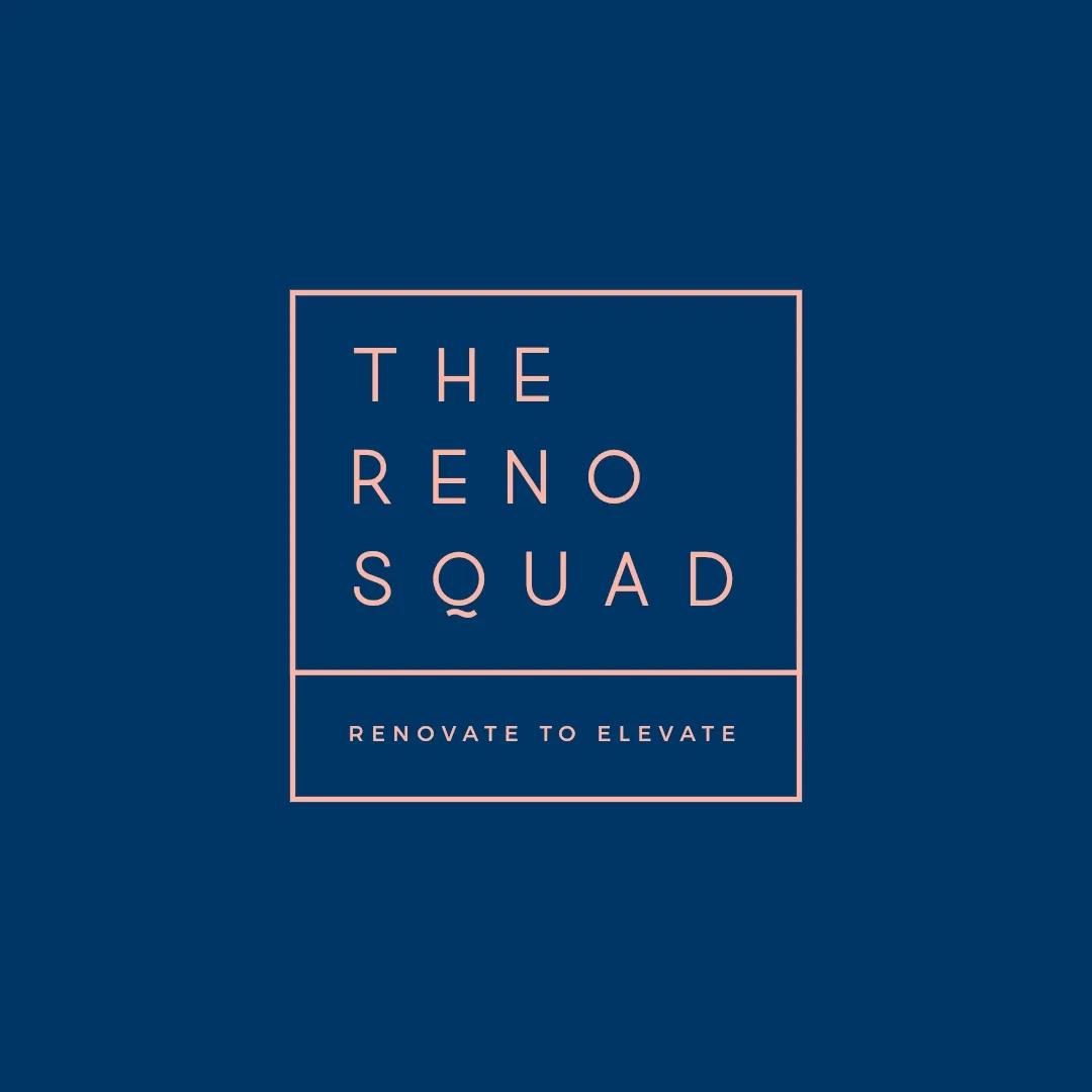
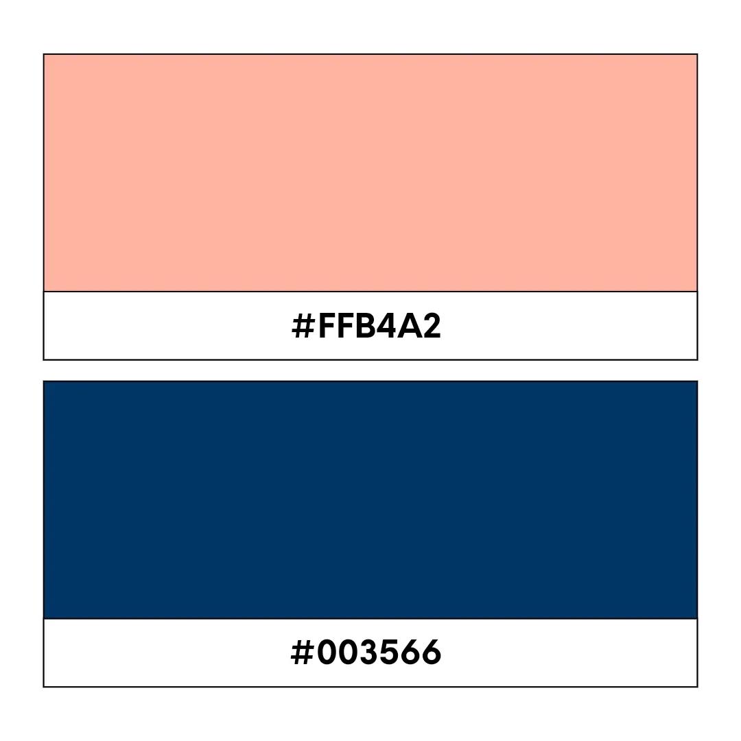
Coral code: #FFB4A2, Navy blue code: #003566
Coral and navy blue blend beautifully for a bold, head-turning color scheme. The vibrancy of the coral adds energy and enthusiasm, while the classic navy blue brings a sense of trust and reliability. This deep combination is perfect for quirky brands in the food, hospitality, nightlife, and entertainment verticals.
21. Taupe and charcoal grey
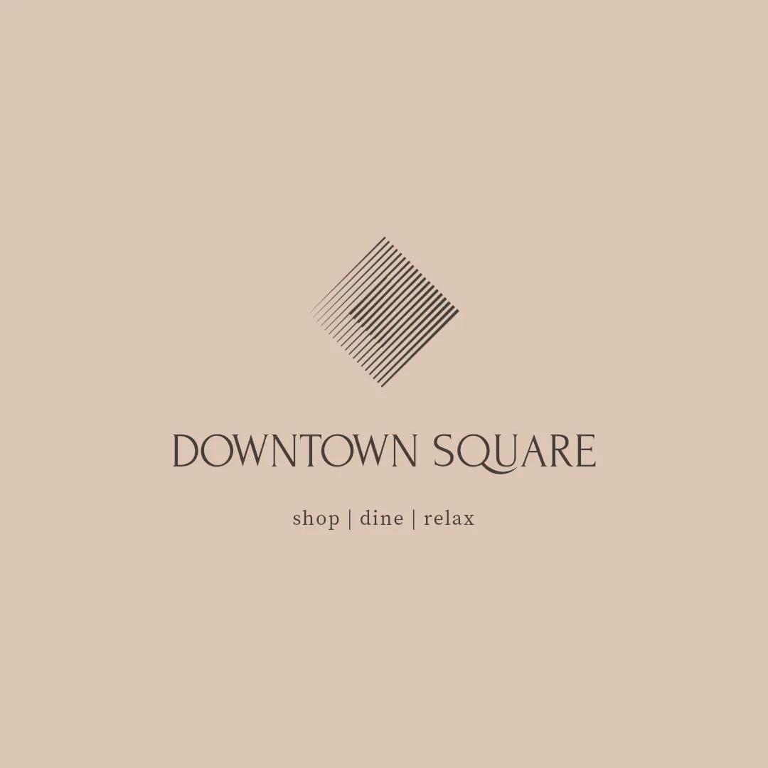
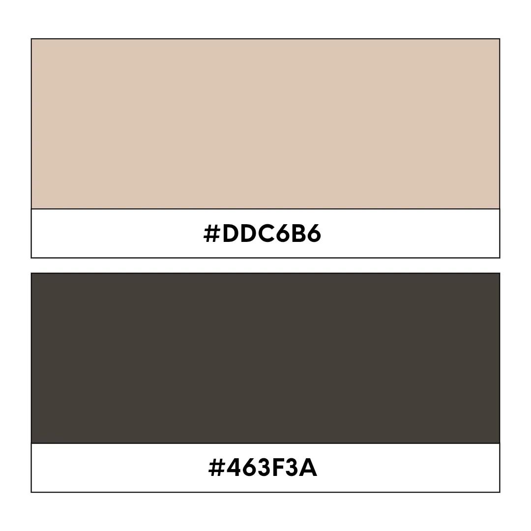
Taupe code: #DDC6B6, Charcoal grey code: #463F3A
Classy, classic, and alluringly subtle, this logo color combo says, “I’m stable, trustworthy, and I’ll deliver on my promises.” That said, this visual blend is perfect for hotels and brands working in high-end travel or hospitality.
22. Yellow and red
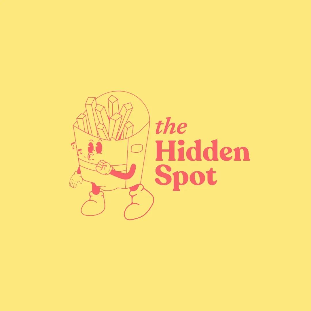
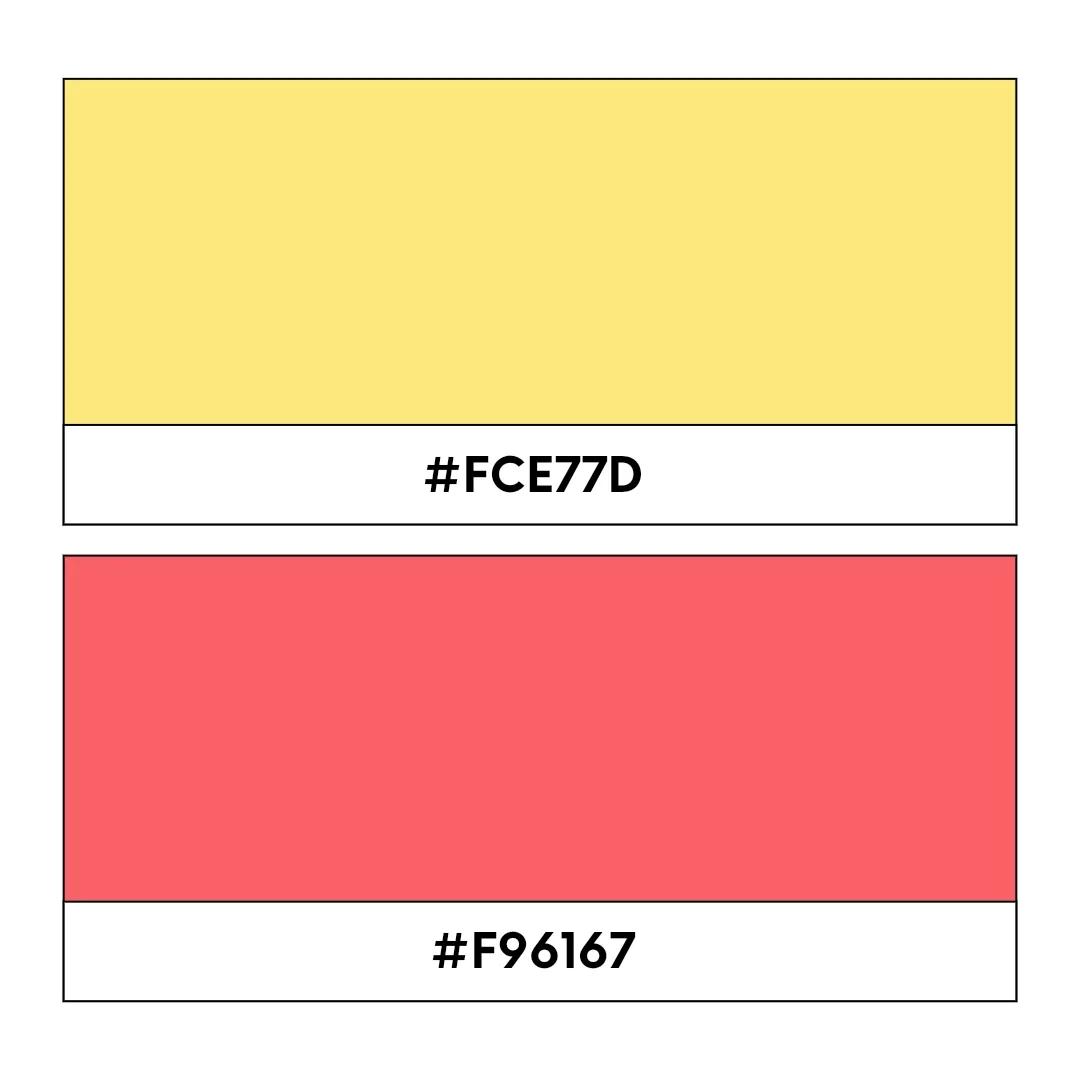
Yellow code: #FCE77D, Red code: #F96167
This punchy and vibrant logo color combination will stop people from scrolling in their tracks. Because both hues are contrastingly vibrant, they work with one another to create the kind of definition that will make your logo stand out and be remembered. Slick yet fun-filled, this color combo will work well if you’re looking to appeal to a younger audience.
23. Electric blue and neon pink
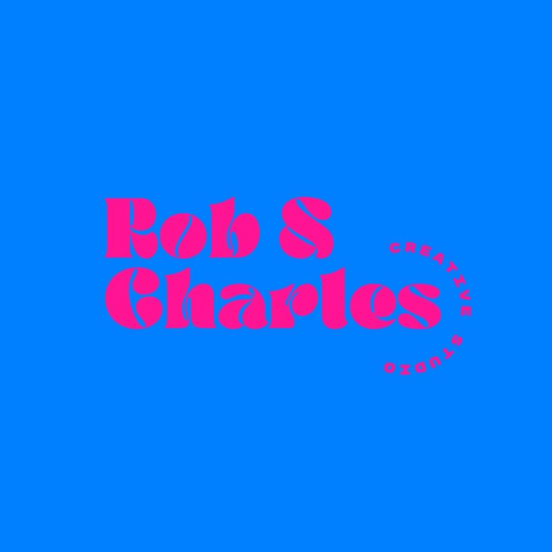
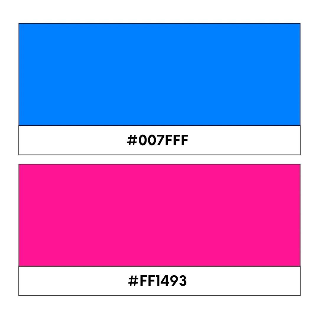
Electric blue code: #007FFF, Neon pink code: #FF1493
Electric blue meets neon pink to create a high-energy, jaw-dropping color palette. The electric blue symbolizes untapped innovation, while the neon pink adds a playful touch that is likely to appeal to a young, trendy audience. This logo color combo is brilliant for businesses that have a bold or exciting brand mission in any sector imaginable.
24. Lime green and charcoal grey
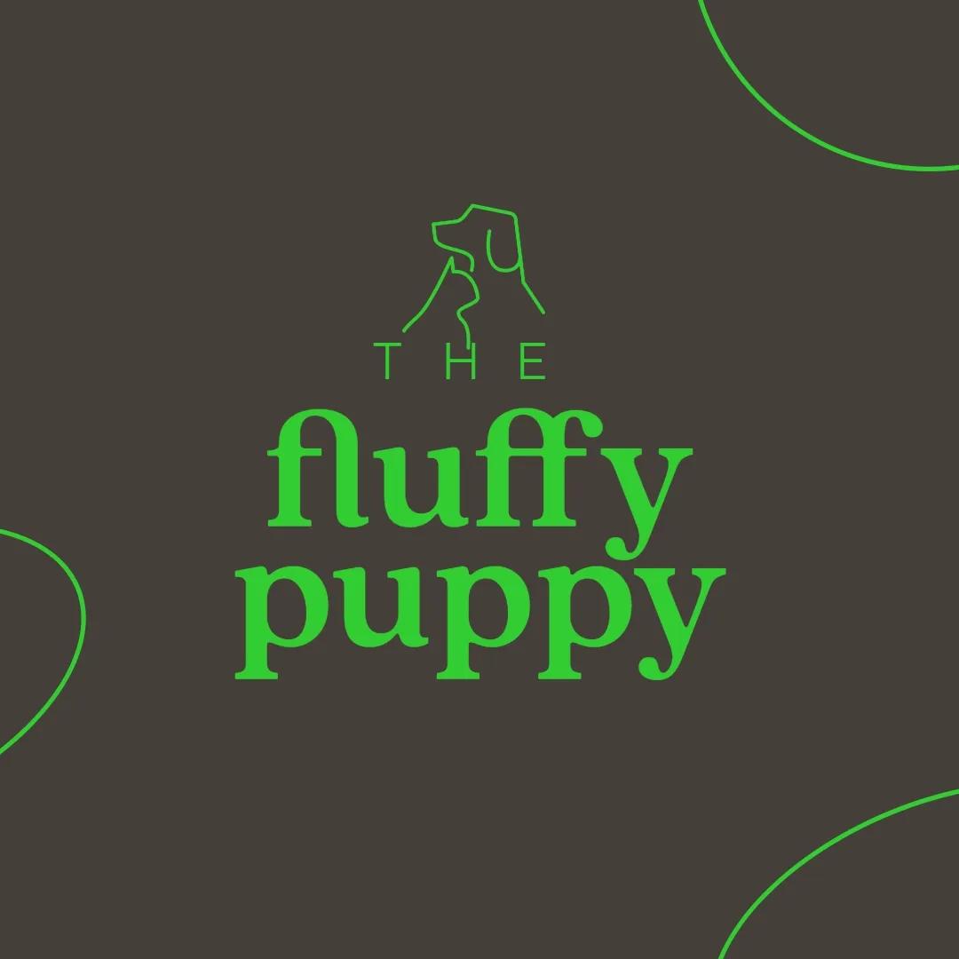
Lime green code: #32CD32, Charcoal grey code: #463F3A
This is another punchy logo color scheme that’s balanced, eye-catching, and coolly confident. The zesty lime green symbolizes growth and energy, while charcoal grey adds just the right splash of sophistication and stability. This combination is perfect for businesses aiming for a modern and professional image that consumers can trust.
25. Orange and teal
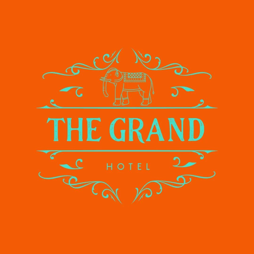
Orange code: #F35B04, Teal code: #40E0D0
Orange and teal clash in the most harmonious fashion to serve up a cheerful, inviting blend of logo colors. The highly energetic feel of the orange symbolizes enthusiasm and creativity, and the calming essence of the teal brings balance. This combination is perfect for brands and businesses in the adventure or niche retail sectors.
Three-color combinations
26. Red, navy, and yellow
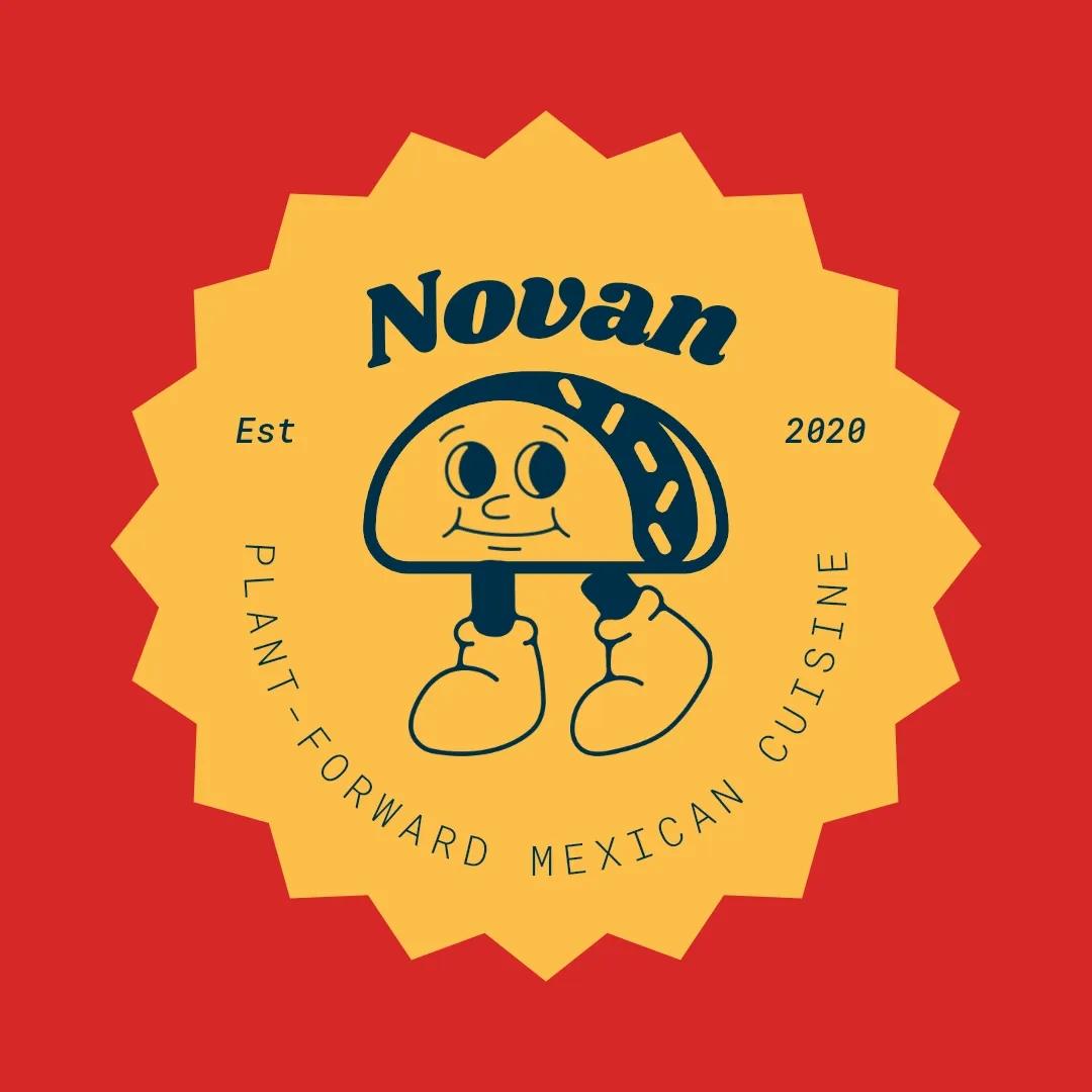
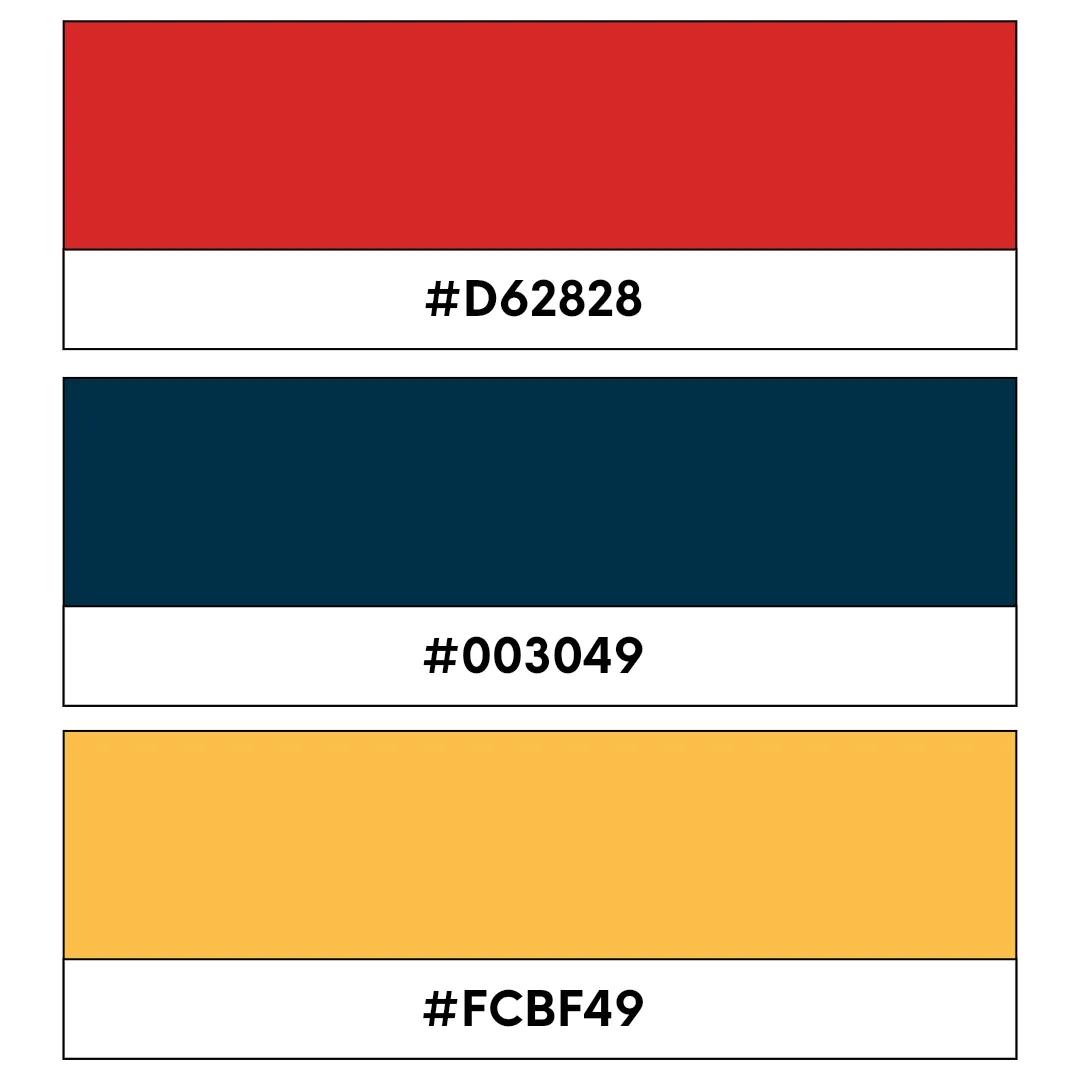
Red code: #D62828, Navy code: #003049, Yellow code: #FCBF49
These three logo colors create a visual scheme that’s bold and vibrant without being too brash or overpowering. While each of these three colors is contrasting, they create the kind of synergy that offers a crisp, clean branding that screams confidence. Each tone weaves around the other brilliantly to make any graphic or font pop. It’s the perfect blend for restaurants, food vans, or entertainment brands.
27. Blue, green, and white
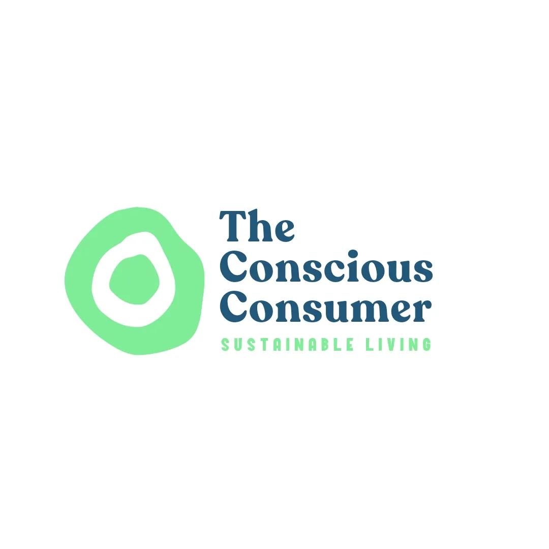
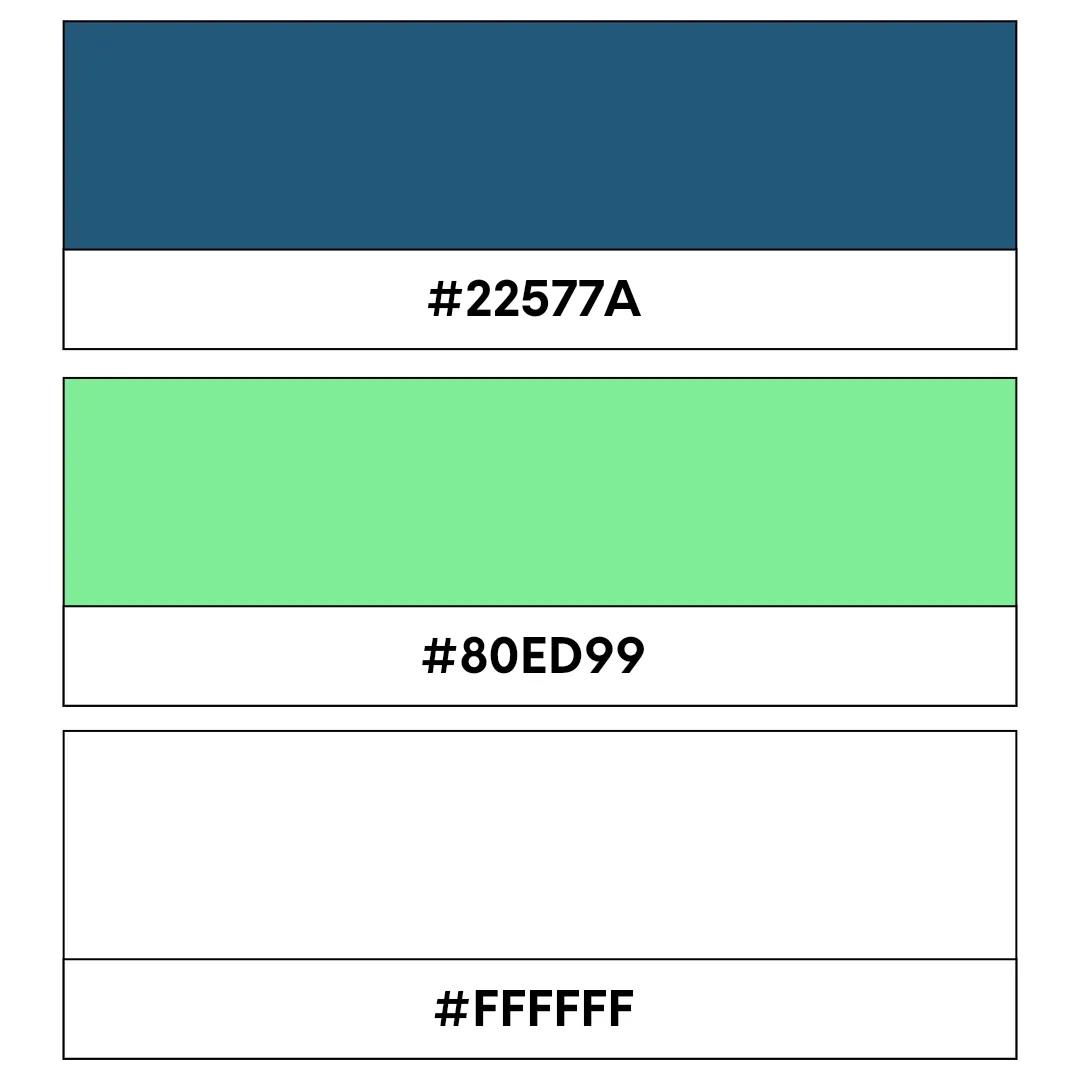
Blue code: #22577A, Green code: #80ED99, White code: #FFFFFF
This combo says, “We’re fresh, forward-thinking, and eco-friendly.” Ideal for a health or planet-conscious brand, this triple-threat logo color combo evokes trust, growth, and purity. This is specifically perfect for wellness startups or sustainable products; it brings a clean, natural vibe to your business.
28. Red, black, and gold
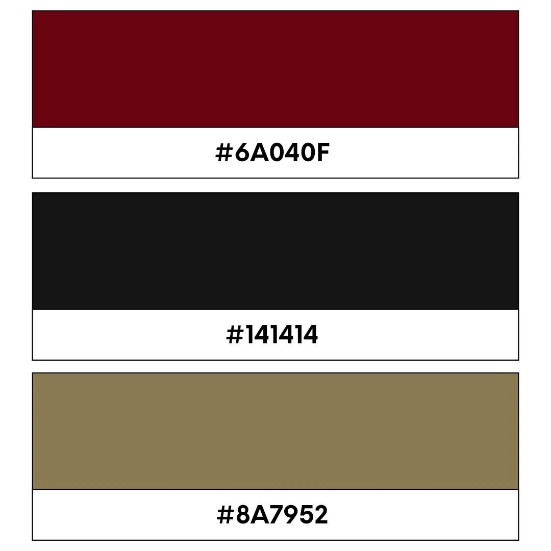
Red code: #6A040F, Black code: #141414, Gold code: #8A7952
Bold, bodacious, and lavish, this trio is the epitome of power and sophistication. Think high-end fashion or luxury goods companies that want to give off an air of exclusivity and prestige. The perfect way to make a big statement if you operate in the field of luxury goods.
29. Orange, navy, and grey

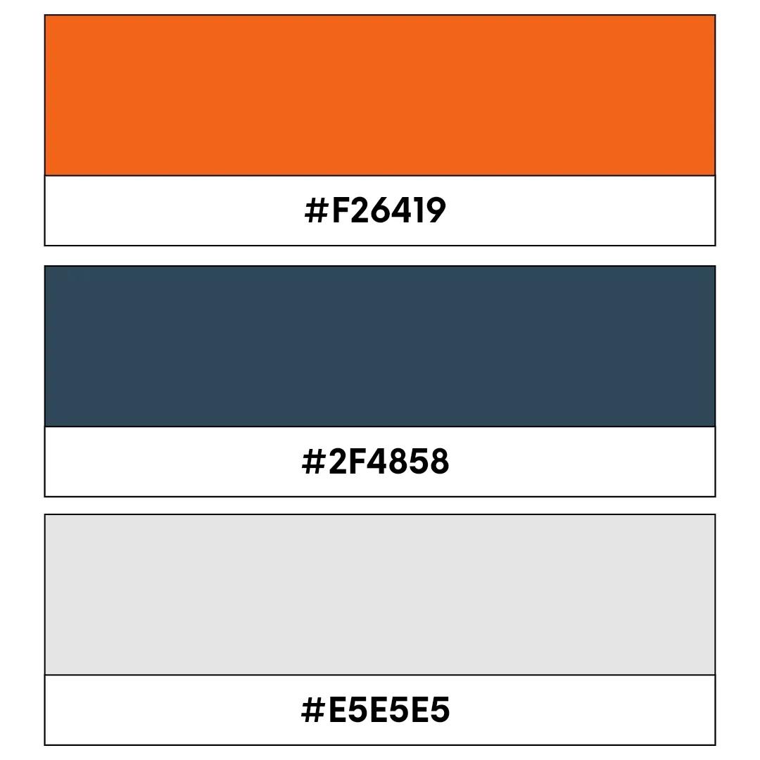
Orange code: #F26419, Navy code: #2F4858, Grey code: #E5E5E5
Orange, navy, and gray combine boldness with balance. The vibrant orange draws attention, while the cooler navy and gray tones add structure and credibility. This palette works well for brands that want to stand out while maintaining a polished image.
30. Purple, silver, and black

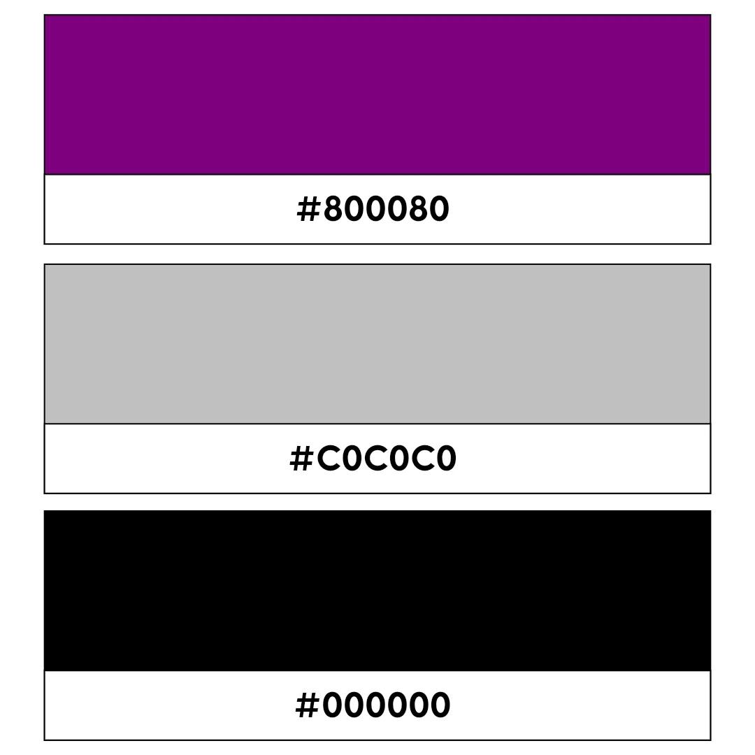
Purple code: #800080, Silver code: #C0C0C0, Black code: #000000
Rich and contemporary, this mix of tones creates a sense of creativity and elegance. Brilliant for beauty brands or upscale services (like consultancy or luxury personal shopping), this color scheme offers a touch of luxury without trying too hard. It’s all about sophistication with a hint of mystery and allure.
31. Teal, coral, and white
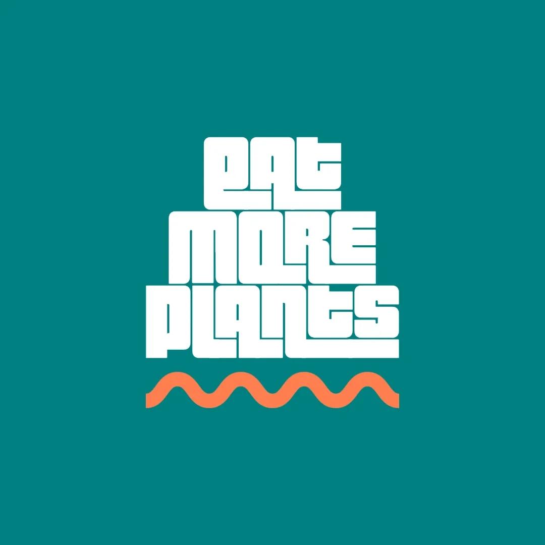
Teal code: #008080, Coral code: #FF7F50, White code: #FFFFFF
Fresh, lively, and super vibrant, this punchy combo is fantastic for lifestyle brands or health and wellness companies. It’s modern, friendly, and gives off a true sense of vitality. Think of it as a breath of fresh air for your branding, especially if you’re a business that offers exciting niche services or experiences.
32. Maroon, gold, and white
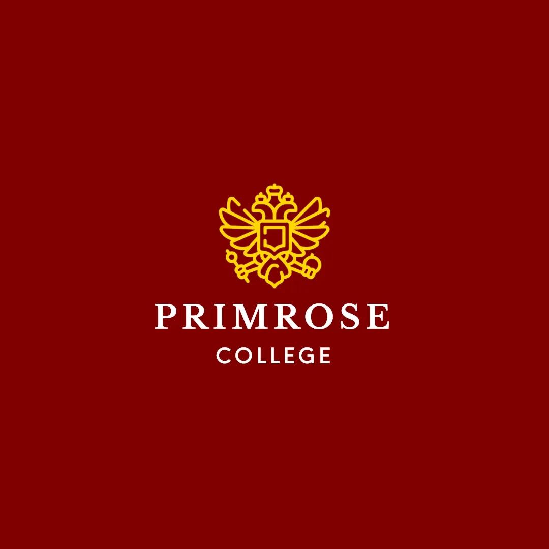
Maroon code: #800000, Gold code: #FFD700, White code: #FFFFFF
Classic and prestigious, this tri-color combo is perfect for educational institutions or law firms. It symbolizes traditional excellence and adds a slight peppering of old-school charm with a modern twist. It’s all about showcasing heritage with a polished edge.
33. Yellow, black, and white

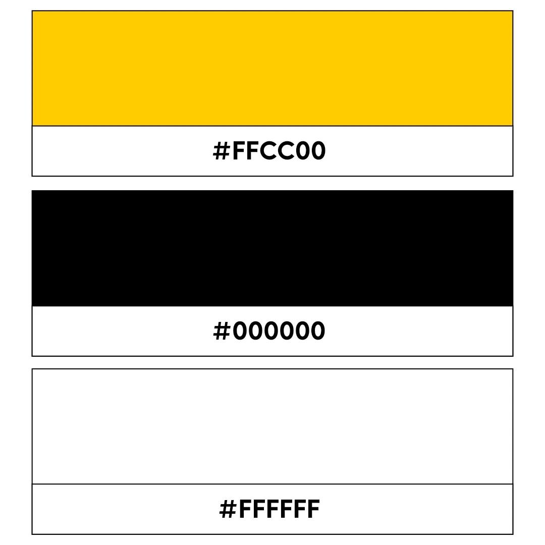
Yellow code: #FFCC00, Black code: #000000, White code: #FFFFFF
This bold, high-contrast palette is perfect for a budding tech firm or construction company logo. It’s visually striking and has a vivid sense of clarity, which will make your brand stand out like a beacon. This combo is dependable but will cut through the digital noise and grab attention when it counts.
34. Turquoise, navy, and beige

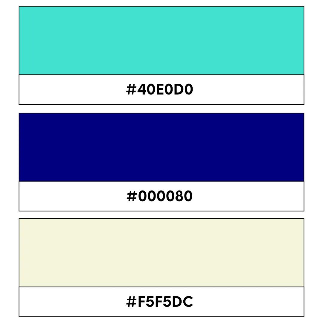
Turquoise code: #40E0D0, Navy code: #000080, Beige code: #F5F5DC
Calm, cool, and decidedly sophisticated, this three-color combo is a solid choice for travel agencies or real estate firms with a modern mindset. Each tone works in harmony to combine tranquility with trustworthiness, creating a serene yet professional look. It’s ideal for brands wanting to convey reliability and stability.
35. Pink, grey, and white

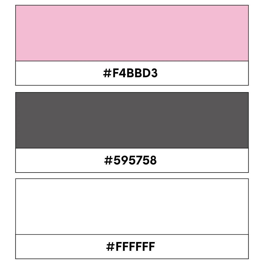
Pink code: #F4BBD3, Grey code: #595758, White code: #FFFFFF
Soft and professional, this logo color combination is ideal for beauty brands or classy fashion boutiques. It blends femininity with a modern touch, making it both approachable and stylish. If you want to tell potential customers that you’re chic yet warm and welcoming, this is the scheme for you.
36. Green, brown, and cream

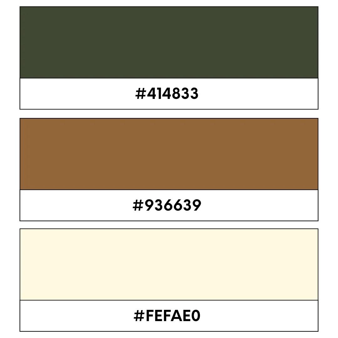
Green code: #414833, Brown code: #936639, Cream code: #FEFAE0
This earthy palette suits organic brands or outdoor adventure companies down to a tee. It highlights sustainability and a deep connection to nature, which is ideal for eco-conscious businesses. This scheme is centered around embracing the natural world with beauty and elegance.
37. Aqua, denim, and white
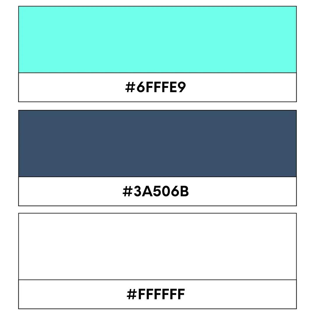
Aqua code: #6FFFE9, Denim code: #3A506B, White code: #FFFFFF
Refreshing, relaxing, and clear-cut, this tone trio is perfect for aquatic brands or tech companies that innovate in the fitness or outdoor sector. Aqua and denim blue conjure up visions of the open water, while white adds a crisp, modern touch. It’s a scheme that marries vibrancy with reliability.
38. Red, white, and blue
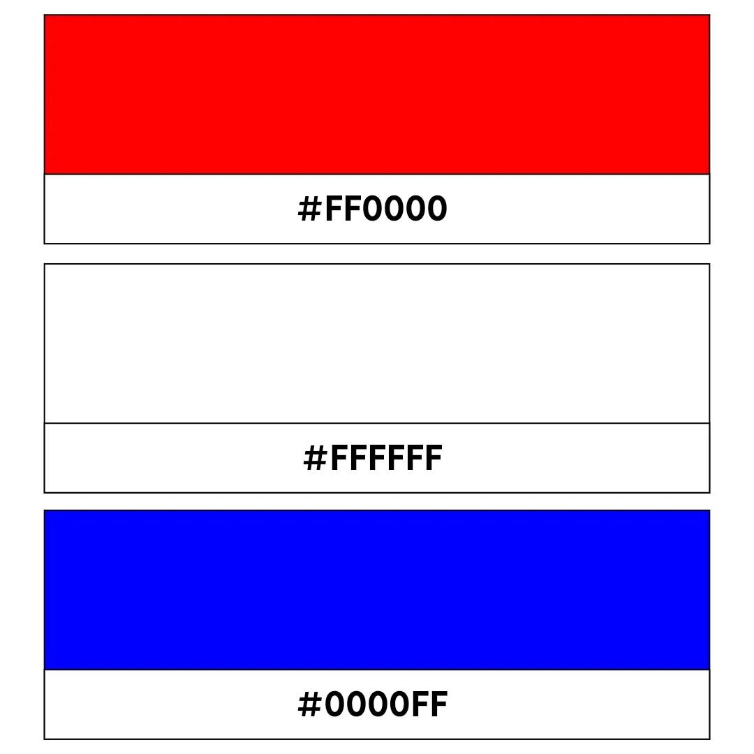
Red code: #FF0000, White code: #FFFFFF, Blue code: #0000FF
This combo remains a classic because it commands attention. It’s ideal for companies wanting to convey strength and trust. Think security firms or governmental organizations that need to showcase a strong and reliable presence that you can count on.
39. Green, yellow, and black

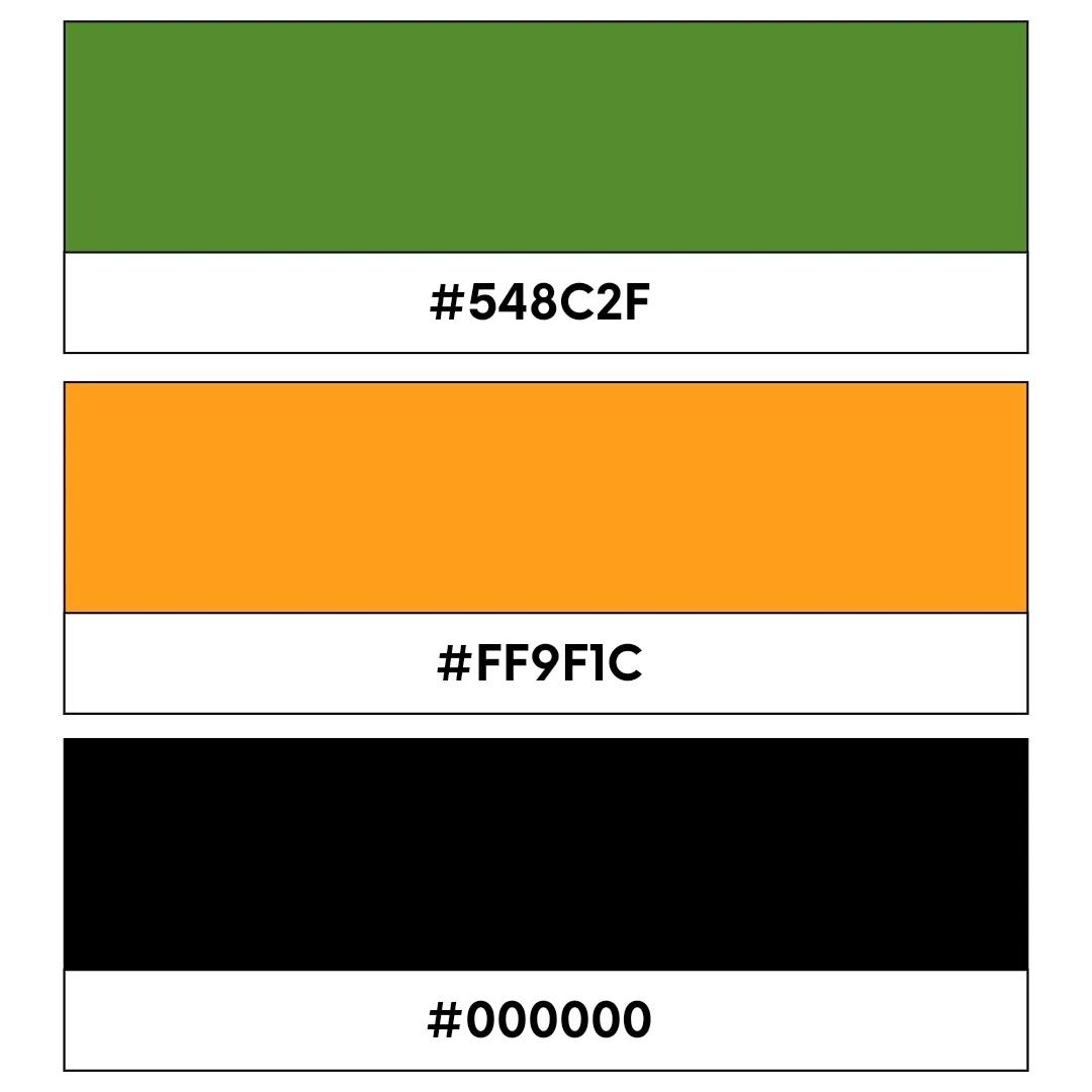
Green code: #548C2F, Yellow code: #FF9F1C, Black code: #000000
Vibrant and energetic with just the right amount of edge, this palette is a great option for sports teams or fitness brands looking to communicate their energy. Green and yellow bring vitality and enthusiasm, while black punctuates the design with authority and power.
40. Pink, purple, and cream
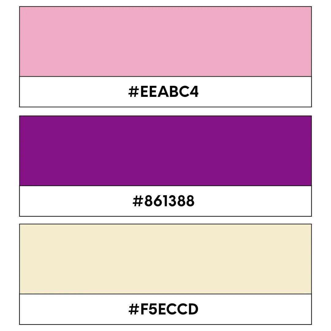
Pink code: #EEABC4, Purple code: #861388, Cream code: #F5ECCD
Feminine and playful, this combination is ideal for beauty or fashion brands targeting a younger audience. Pink and purple give off a sense of creativity and fun, while the white adds a touch of elegance and simplicity.
41. Blue, orange, and white
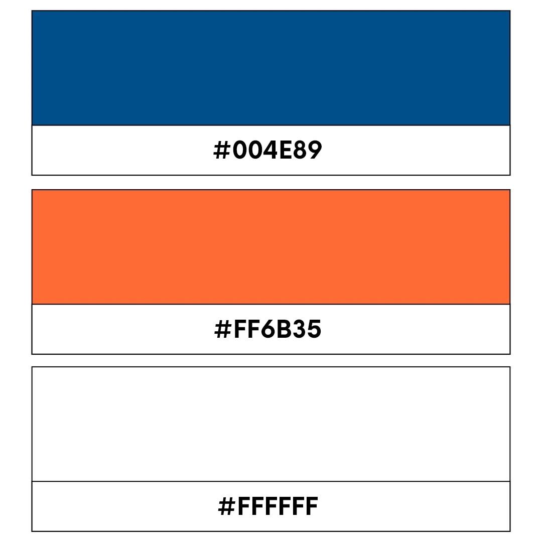
Blue code: #004E89, Orange code: #FF6B35, White code: #FFFFFF
Dynamic and pleasing to the eye, this color combo is a solid selection for tech startups, established businesses, or brands offering educational platforms to their customers. Blue brings trust, orange adds energy, and white offers clarity, making it ideal for brands brimming with innovation.
42. Black, blue, and gold

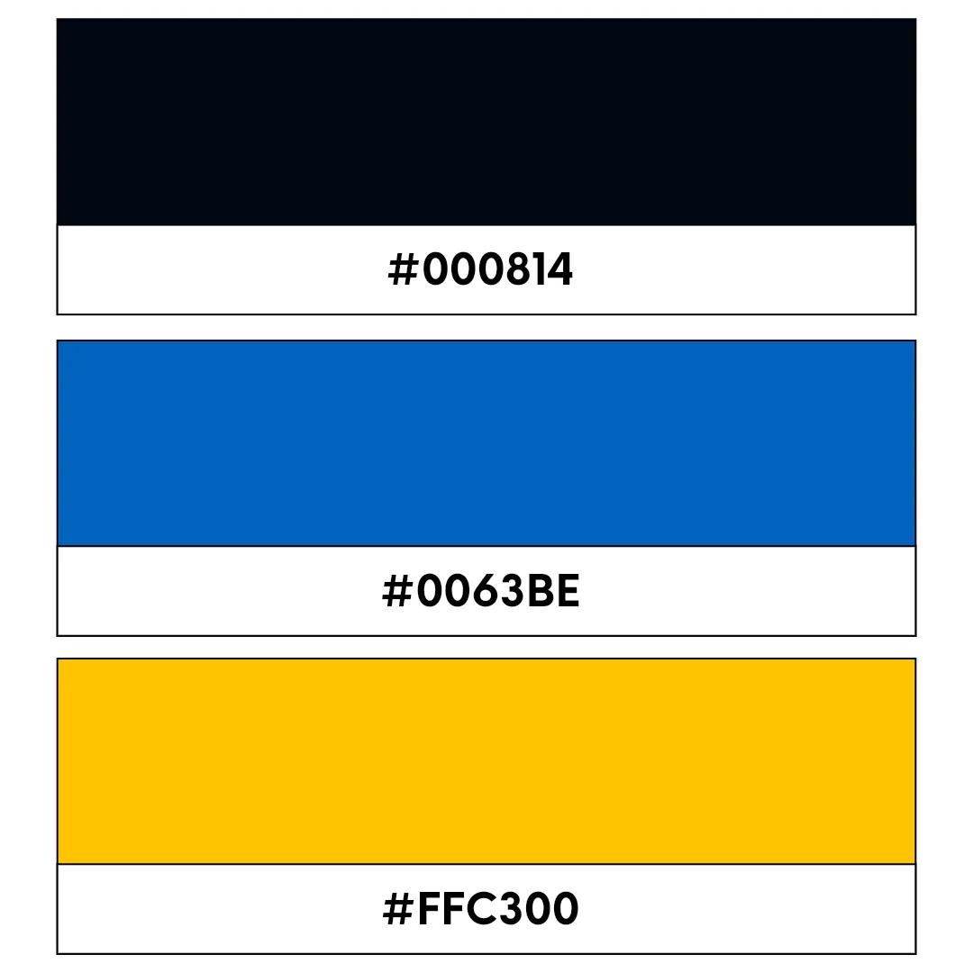
Black code: #000814, Blue code: #0063BE, Gold code: #FFC300
This timeless palette is perfect for fintech brands and anyone offering top-shelf products or services. Black and blue convey wealth, security, and prestige, while gold keeps the design clean and modern.
43. Green, blue, and yellow

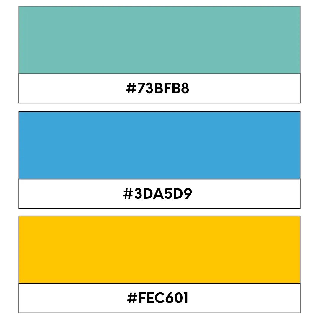
Green code: #73BFB8, Blue code: #3DA5D9, Yellow code: #FEC601
These fresh, vibrant colors complement one another to emit a real sense of calmness, trust, and brand vision. It’s great for eco-friendly products or children’s brands. Green symbolizes nature, blue brings calmness, and yellow adds a splash of optimism and energy.
44. Red, silver, and black
Red code: #FF0000, Silver code: #C0C0C0, Black code: #000000
This bold, modern logo color combination is great for automotive brands or tech companies that offer devices and wearables. Red adds excitement (or even a dash of danger), silver brings a sleek, futuristic touch, and black grounds the design with edgy sophistication.
45. Purple, yellow, and white

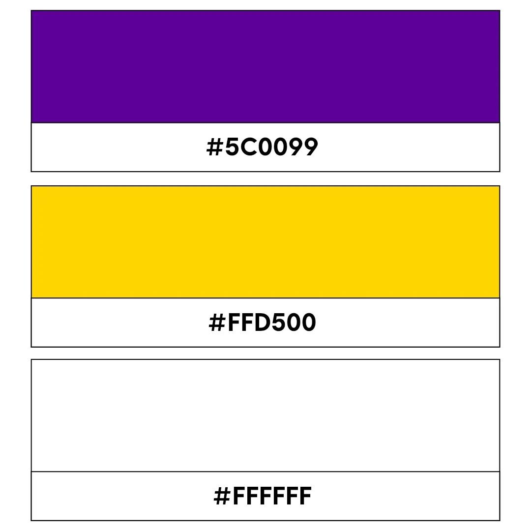
Purple code: #5C0099, Yellow code: #FFD500, White code: #FFFFFF
Creative and cheerful, this combination is perfect for brands offering educational toys or arts and crafts supplies. Purple suggests creativity, yellow adds a hint of joy, and white keeps the design fresh, crisp, and approachable.
46. Teal, navy, and gold
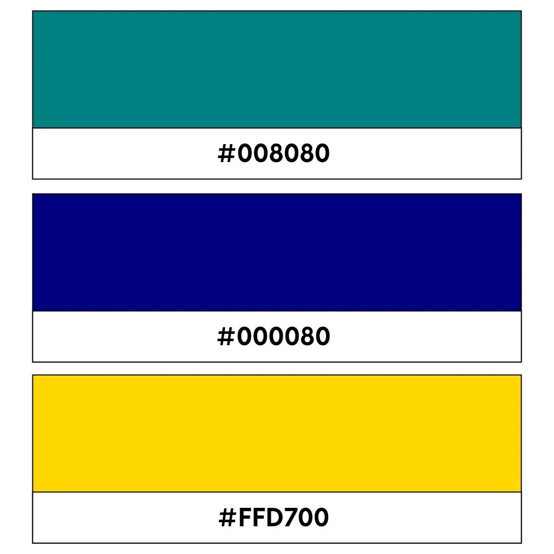
Teal code: #008080, Navy code: #000080, Gold code: #FFD700
Elegant, adaptable, and modern, this collection of colors works well for real estate or interior design brands looking to make a mark in their sector or region. Teal brings a unique flair, navy adds reliability, and gold infuses a touch of untapped luxury.
47. Orange, green, and white
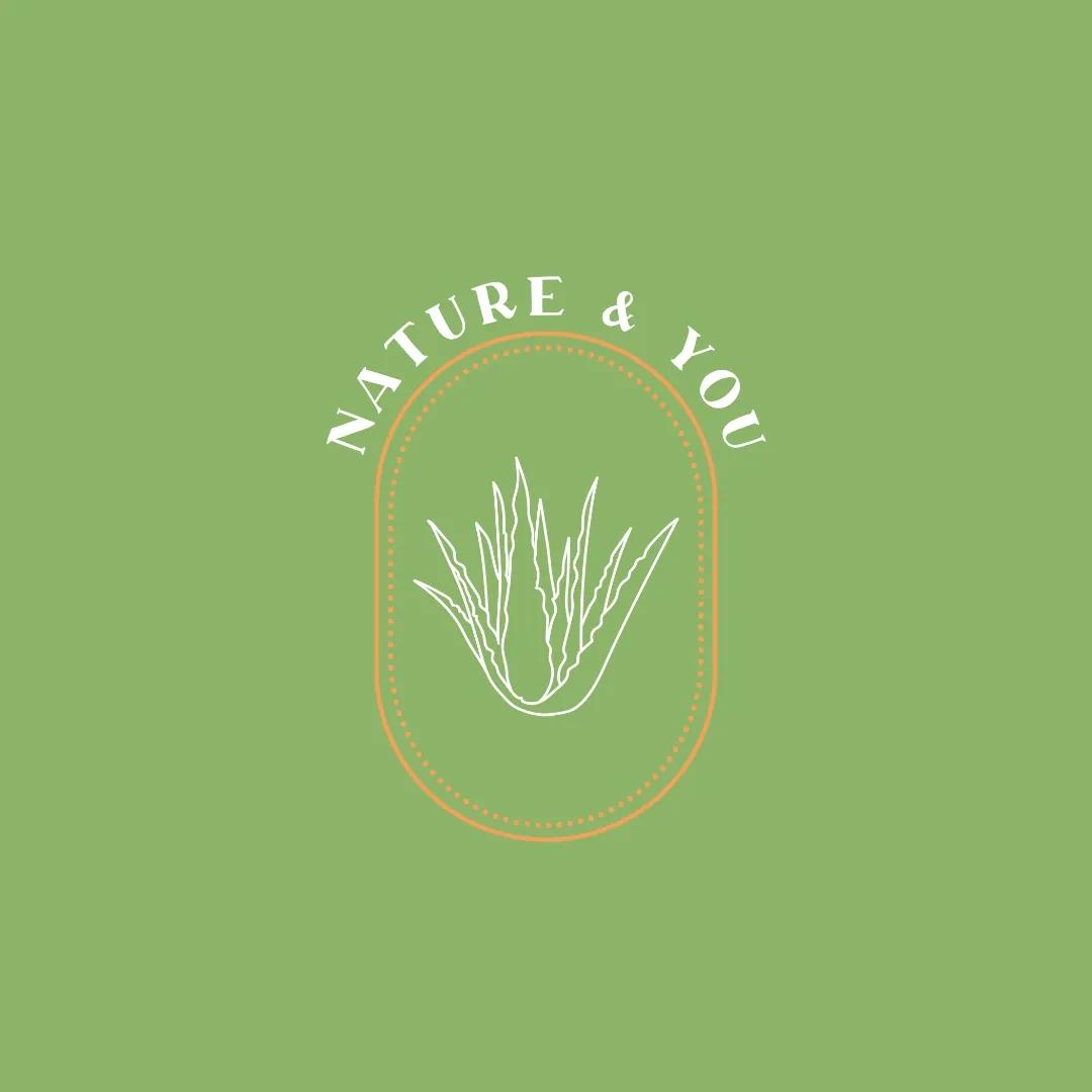
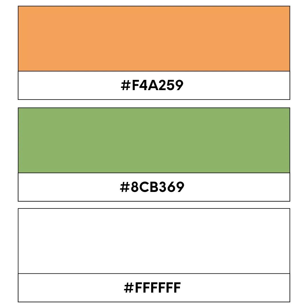
Orange code: #F4A259, Green code: #8CB369, White code: #FFFFFF
This bright, earthy, and energetic logo color combination is ideal for agricultural or outdoor adventure brands. Orange and green have a vibrant connection to the natural world while white ties the whole scheme together with crisp tones and edges.
48. Red, blue, and grey

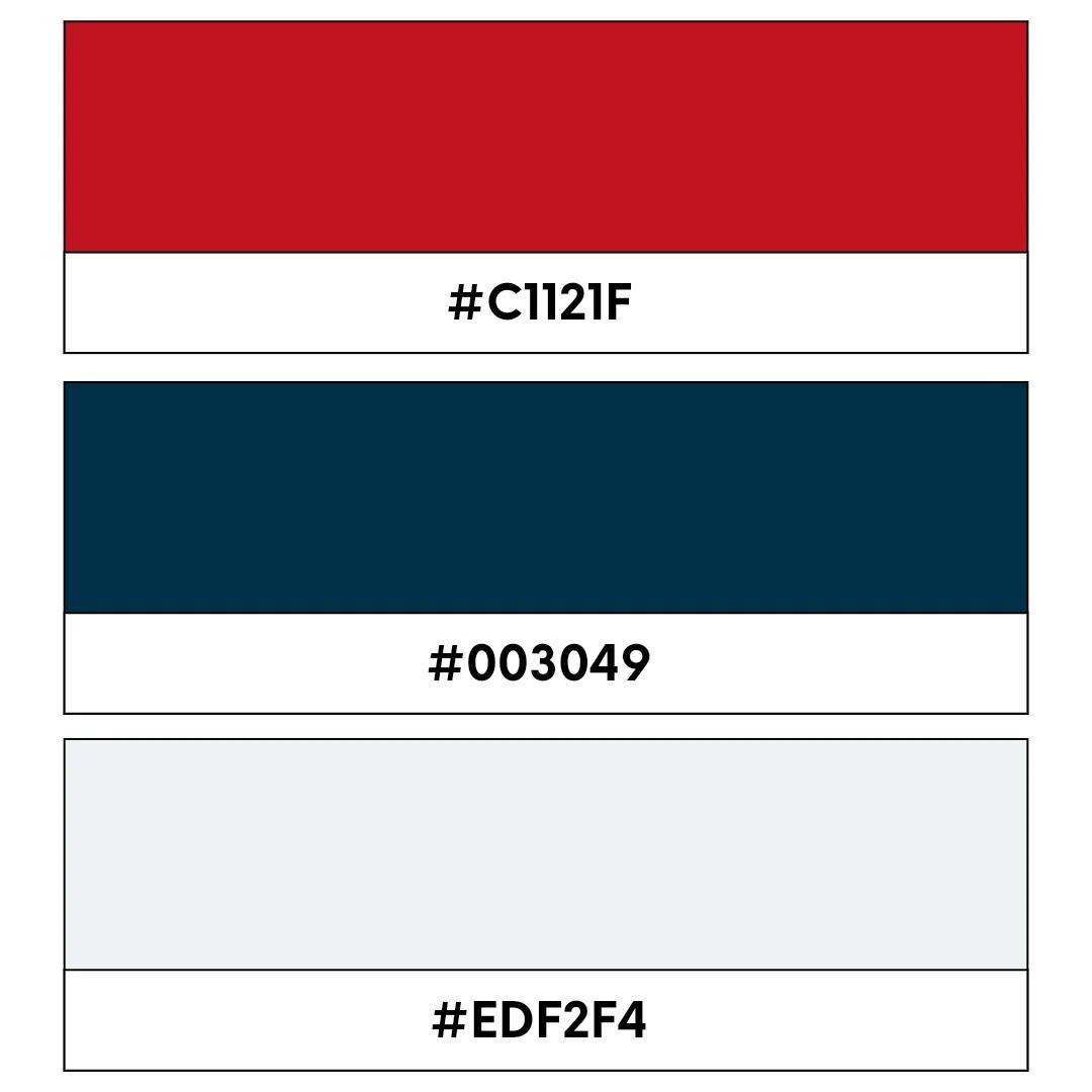
Red code: #C1121F, Blue code: #003049, Grey code: #EDF2F4
Strong, and versatile, this punchy palette suits brands or businesses with a no-nonsense tone of voice and an assured sense of authority. Red brings out feelings of energy, blue adds trust, and grey offers a neutral, professional balance that cannot be ignored.
49. Pink, gold, and cream

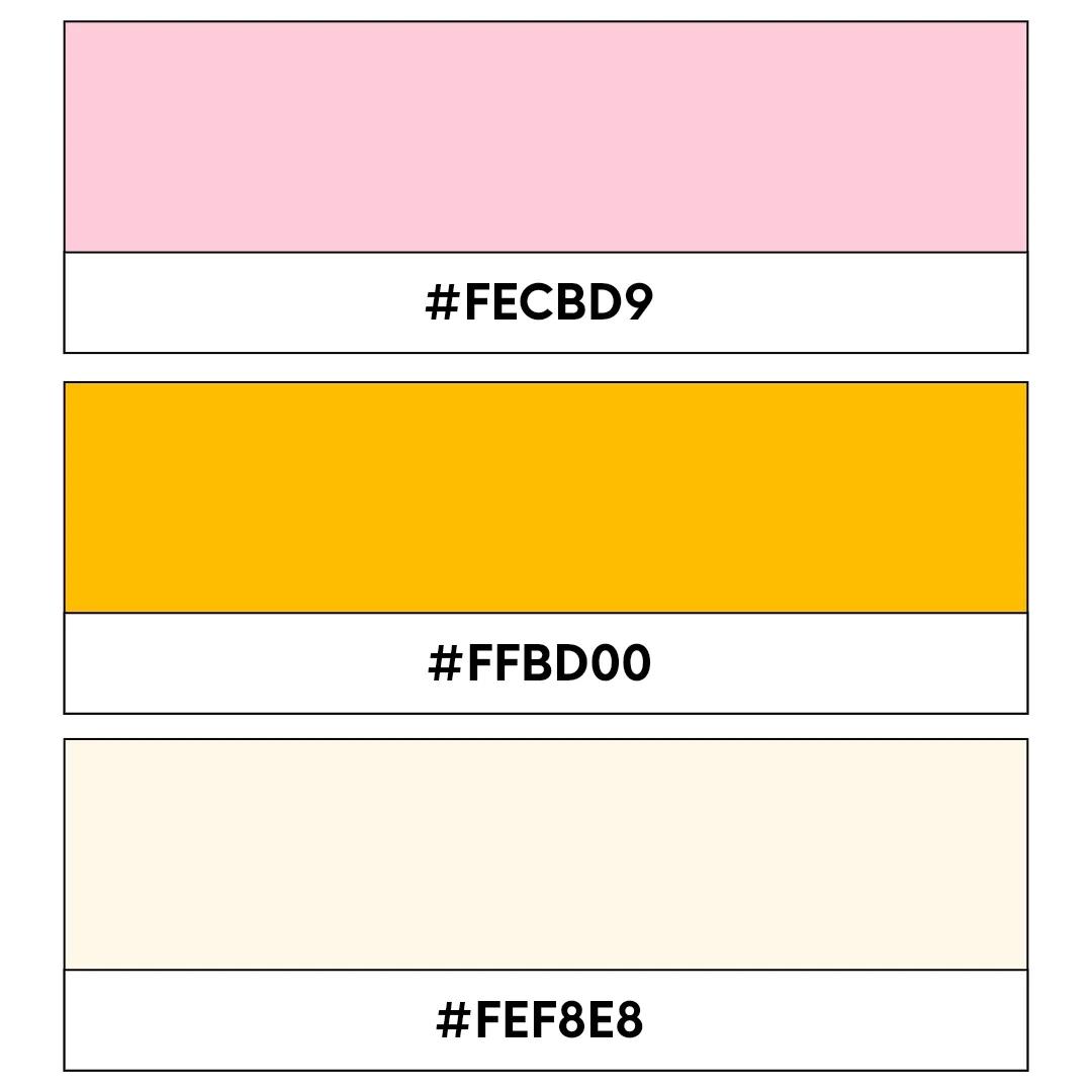
Pink code: #FECBD9, Gold code: #FFBD00, Cream code: #FEF8E8
Chic, sleek, and classy, this three-color combo is perfect for high-end beauty brands, wedding services, and luxury event planning businesses. Pink adds romance, gold brings elegance, and cream keeps the whole scheme timeless in equal measure.
50. Green, navy, and white

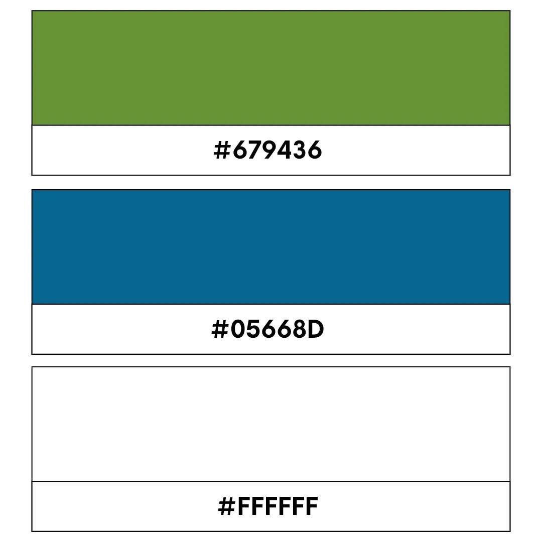
Green code: #679436, Navy code: #05668D, White code: #FFFFFF
This fresh, synergistic combination is ideal for financial institutions with a more charitable edge, non-profit organizations, or eco-friendly brands committed to helping people. Green showcases a connection to the Earth, navy adds a true sense of calm and trust, and white ties it all together with clarity and simplicity.
Try different color schemes with GoDaddy’s logo maker
At this point, you should have a clearer understanding of the meaning of a logo and the role color plays in shaping your brand identity. As you narrow down your options, think about the values you want your brand to represent and the impression you want to leave. Once you’ve finalized your design, it’s important to trademark your logo to help protect your brand as your business grows.
Ready to take the next step? Logo generation is now a dedicated starting point in Airo AI Builder. You can generate logos instantly for your brand, download them in light and dark versions, and establish a consistent identity from day one.